 Wellington Beck Music Group
Nashville, TN
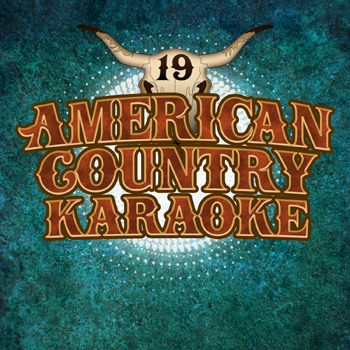
The groundbreaking “American Country Hits” series rolled on with the latest installment, Volume 19. Each volume includes both a “Hits” version (covers recorded by studio musicians) and a “Karaoke” version with instrumental tracks only. The karaoke album art design version that I created is pictured above.
Karaoke album art design story
This time out, I decided I should use a deep turquoise background. I blended a mottled grunge pattern that resembled marble into the rich greenish blue color. Then, I created an inner shadow layer effect for it. This effect fades into the background from a light to dark shade.
I also added a bright white burst brush shape located in the center of the artwork. I situated it between the background and the main title logo layers. When I added a glow layer effect to it, it really made it shine. It also caused the main title text to pop off of the screen.
After that, I contrasted the background elements against the main title. This title uses the same logo I created for the previous installments of the series. I set the words in the LHF Boston Truckstyle font. I proceeded to color it with a rusty shade of red, then added both satin and inner shadow effects to the letters. A light golden yellow inside stroke came together with a thicker brown outline in order to complete the title text’s rustic theme.
All of the elements come together to create an outstanding karaoke album art design. This, as well as all of the other installments in the series, is available on many online music retailers. These include Amazon, iTunes, and many others.
Contact me to create your karaoke album art design
Do you own a record label or a digital music publisher? If you need quick turnaround art to accompany your digital music, I am your graphic designer. Contact me today to get started!

Wellington Beck Music Group
Nashville, TN
This country music album art complements a compilation of country singles produced by some longtime regular clients. Wellington Beck produced digital exclusive albums featuring cover versions of songs by popular artists like Luke Bryan, Blake Shelton, and others. As with past projects, they gave me a lot of creative “rope” and very few specific guidelines.
Country music album art story
I felt that sticking with a base of primary colors and a text focused design would help the art stand out. The client asked me to make the number “50” the most prominent part of this country music album art. Therefore, I set it in a bold red tall serif. I stylized it with a faint inner glow effect and an opaque shadow in order to give it just the right depth.
On the top and bottom, I typed “Country by the Numbers” in a deep blue shade. For these words, I used the Trade Gothic font in a light weight. In keeping with the Old West theme, I then added a rope “lassoing” it the number 50, swooping in from the bottom to grab it. The rope envelopes the number in front and back, creating three dimensions.
Finally, I overlaid the bold and bright artwork with a rusty, sputtered grunge pattern. There is also a faint outline of arrows flying up and to the right. The background also contains some bright beams of light. I was happy that this art successfully blended primary hues with grunge elements and Western themes.
Contact me for your country music album art
Are you an independent country music artist, a record label, or a publisher? Whether you need a print CD art, or a quick turnaround digital art solely for streaming services, I’ve got you covered. Contact me to get started today.
 Marked Youth Camp
Illinois
I made this youth camp logo design for a United Methodist Church sponsored camp based in Illinois. It was an update of their existing logo, which made use of block lettering and a grunge “splatter” element. The Youth Pastor called me to reimagine it with a more modern look and feel.
Youth Camp Logo Design Story
First, I chose the weighty Rockwell Bold font, which was very popular at this time. A font that strong is impossible to ignore, especially with a high contrast design such as this. Then, I filled the letter “A” in red. This represents how Christians are set apart (“marked”) for the Lord’s service. Many of my favorite logo designs leave out the bridge in the capital letter A. I felt that this also helps this design stand out in addition to the color variant.
The client encouraged me to use some swirling vine elements, but to make sure they were “not too feminine”. This gives the design some flair, but is not too over the top. I added a thick black stroke outline around the elements to give it plenty of weight and contrast. Tilting the logo upward also helps to catch the eye. Gradient and embossing effects on the letter A, as well as the black background, help give it a high end feel.
The last elements I included were some subtle grunge cracks around the edges of the text, plus a splatter in the background to give it an edge. Finally, I drafted several variations of the concept for different purposes, such as those in which the grunge elements were not appropriate. This kind of versatility is important to clients who may need to appeal to different audiences for funding, for instance.
Let me create your group or church’s youth camp logo design
Does your church or youth camp need a fresh look? Rebranding could be the key to attract new parishioners or campers. I have extensive experience with religious content, as well as decades in the field of high end logo design. Contact me today to get started.