 George Thompson
Greenville, KY
I loved working on this book cover art, another in a series of Christian book cover design. I created it for Western Kentucky pastor and author George E. Thompson. George is one of the first humans I remember knowing. My parents often took me to his home as a youth, and I attended preschool with his daughter in my small Kentucky hometown. Being his book cover designer really brought our relationship full circle.
Lessons on Gifts and Giving compiles a series of brief thoughts about the gifts of the Holy Spirit. The New Testament books of the Holy Bible describe these gifts in great detail. At the time George commissioned me, I was not doing as much print work as I would have liked. Plus, my family are voracious readers, enjoying a variety of topics. Because of these particular reasons, it was truly a privilege for me to create this religious guide’s artwork.
Book cover art – front cover fonts and colors
George gave me a lot of creative freedom for this project. I took a few steps back to ponder how I could properly depict such awe inspiring subject matter. First, I used one of my favorite color combinations, which is blue, orange, and yellow. The bright colors set against the dark background creates a stark contrast. This specific contrast brings the weight and power to the design, which the book’s theme called for.
Also, I jumped at the chance to use one of the many ribbon style fonts that were trendy at the time. This was an appropriate setting, considering that the focal images centered around gift packages. I also made use of the equally trendy Museo Slab font. It spells out the rest of the text content featured in the book’s layout. I set the main titles on the cover over parallel orange ribbon shapes, which rise upward at an angle. This effect makes the ribbons stand out even more. They have a positive, uplifting feel of forward motion.
Focal image and filter effects for Christian book cover design
Completing the front design, a dark and mysterious figure appears in the cover’s background. This mystery man represents the Holy Spirit. The Bible characterizes the Spirit as a comforter, as well as a guide to believers in Christ. The image of Him holding the glowing golden gift package really sums up the main idea of this book’s topic.
I began by selecting the perfect royalty free stock photo for the focal image. In its initial form, it depicted a businessman who is holding a shiny gold gift package. By using the Adobe Photoshop app, I then desaturated it. I followed up by cut the package out from the photo. Next, I separated it into its own layer, situated in the cover’s foreground. I recolored and darkened the background figure blue. After that, I faded him into the black background in order to cement its intriguing appeal.
Graphic design effects and filters for book cover art
Wrapping up the design for this tome’s front cover, I should discuss the effects used in the focal image. Let me clarify that I do not typically make use of very many Photoshop filters in my work. It is easy to overdo effects. Sometimes graphic artists make the mistake of throwing them in haphazardly. Because of this, their work can suffer. This is easy to do, even for seasoned pros. However, I felt that the halftone and glow effects were the appropriate finishing touches. They completed the design in order to convey the spiritual theme of this book.
The ethereal Photoshop filters come together in order to make the glowing golden package pop out. I drove home the spiritual theme on the book’s cover, while still retaining a clean and modern feel.
Book cover art – back cover design story
The quaint wrapped gift boxes on the back cover also reflect the book’s warm and inviting feel. Humble plaid and butcher paper patterns cover the presents. Each of them is wrapped with a tasteful blue ribbon. I faded them into the pale yellow solid background so they would not compete with the text.
The synopsis, as well as the paragraph describing the author’s credentials, are also featured on the back cover. These passages invite both believers and nonbelievers alike to learn about God’s many great gifts to us.
In conclusion, this Christian book cover design was a great opportunity to use my gifts. Specifically, I am referring to creating the perfect graphic design solutions for my clients. I am happy any chance that I get to both honor God with that gift and help a friend with their own passion project at the same time.
Head over to Amazon and pick up your paperback copy of “Lessons on Gifts and Giving”.
Need a book cover designer? Let me design your book cover art
You have finished the long and arduous process of writing the perfect manuscript. After that, you went through the steps of painstakingly editing that content. Finally, your literary labor of love has been completed. Every chapter and every page is now finished. Hold up, you can’t take your book to press just yet! Now you need the right cover design, and it needs to be done precisely to spec by a professional book cover designer. You have completed the hard part, so why not let me make your book cover art easy? I possess the education and experience, as well as the eye for detail to get the job done.
What are you waiting for? Go ahead and contact me today.
 Courtney From Work


 Various
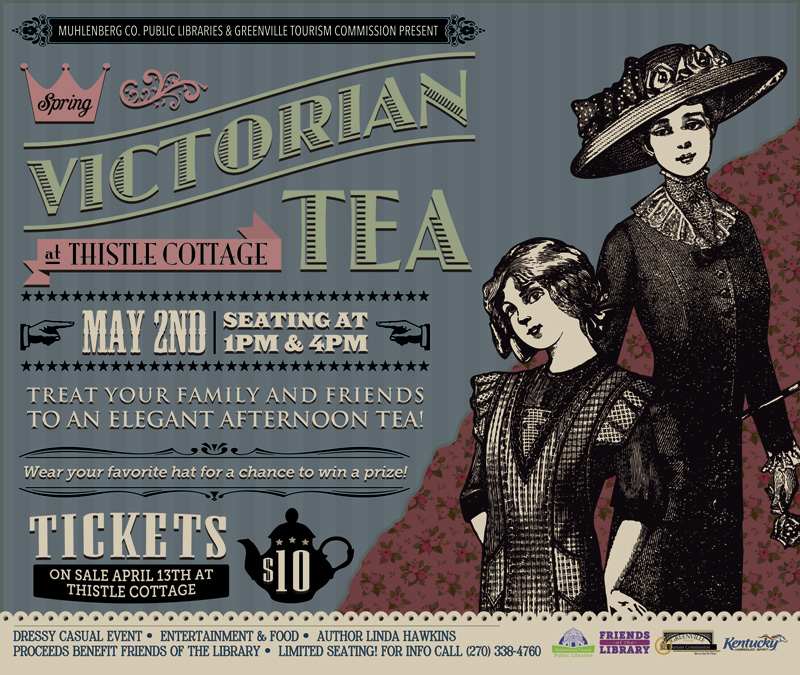 Muhlenberg County Public Libraries / Thistle Cottage