Christopher Sprankle
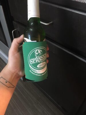
Sprankle also used the design on a drink koozie.
Franklin, TN
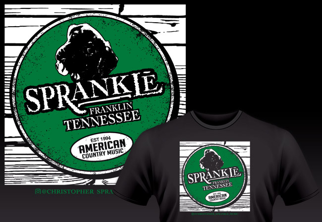
I made this parody shirt design for the Tennessee based country music singer Christopher Sprankle. When Chris moved to Lexington, KY, his manager contacted me for a two color shirt art. She sent me a favorite photo of Chris’s dog Grizzly, since he is popular with Chris’s rabid Instagram followers. Then she sent a photo of a rusty can of Grizzly brand smokeless tobacco to incorporate.
First of all, I mocked up the word “Sprankle” in place of the Grizzly logo. Since the logo is a hand drawn design, rather than a commercial font, I had to draw up the grunge text manually.
After that, I simplified the photo of Grizzly in Photoshop into a black and white image, then I further contrasted it in Adobe Illustrator to finish the effect.
Topping off the parody shirt design

Photo of Grizzly the dog used for the parody shirt design.
Because I had a few more elements left to work with, I made a few suggestions. The client loved every one of my ideas, so we ran with them. First, I reworded “Long Cut Wintergreen” to Sprankle’s hometown Franklin, TN. I also improvised “American Country Music” instead of “American Snuff Co”.
Finally, I wanted to use “Est. 1903” from the original oval text, so I decided to change it to to Sprankle’s birth year of 1994. I added in some grunge around the edges since the design needed a weathered feel. In the end, Sprankle’s fans loved it, so I guess you could call it a smash hit.
See the photo I started with on the right, then follow Chris’s music on Instagram here.
Contact me for your parody shirt design
Whether you are a country musician or a Christian bookstore, parody shirt designs can be big sellers. Contact me today for the right fit.
 Wellington Beck Music Group

 Wellington Beck Music Group