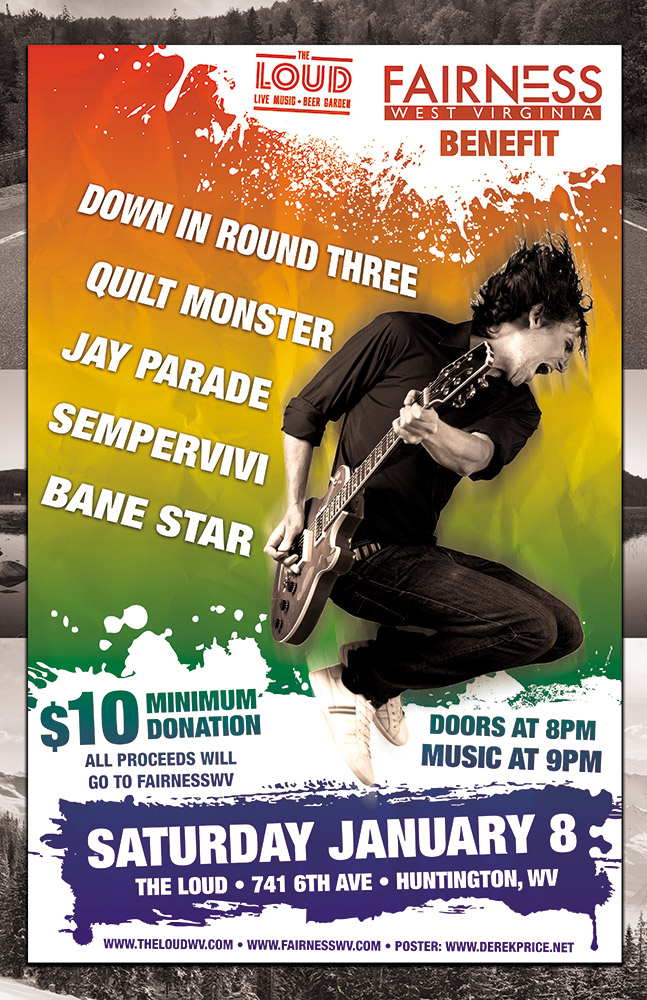
West Virginia based band Jay Parade offered my band Sempervivi a spot on this benefit show they were holding for Fairness WV. The guys liked my poster design for another show we did together, so they asked if I would donate my time for this cause. I happily agreed to provide this LGBTQ fairness poster design.
LGBTQ Fairness Poster Design Story
Josh from Jay Parade gave me all of the information about the equality event, such as the bands performing and the starting time. I contacted the venue, as well as Fairness WV, to obtain their logos. Since the organization had confidence in my skills, they did not insist on any specific design elements for the layout. Although I knew I wanted to include a rainbow in some way, I didn’t want to stoop to cliches or pandering. When working on a project such as this, it is easy to make it too cute. I wanted to create an eye catching, bright poster that clearly announced what the event was, as well as its goal.
Using negative space for some of the typography was another goal. White “paint” splatters create that negative space in front of the rainbow color gradient background. I reversed out both the logos at the top, as well as the date and other information at the bottom. Then I added a rad rocker jumping with his guitar as the focal image. I reduced the image down to black and white, so it would stand out in front of the rainbow background. Once I added a motion blur filter, the guitarist was complete. Each of the band names features a perspective warp to give it some motion as it wraps around the guitarist.
When I put all of those elements together, I thought it was good, but not quite complete yet. In order to complete the LGBTQ Fairness Poster Design, I shrunk everything down and centered it. Then, I created an homage to the Appalachian mountains shared by West Virginia and my home state of Kentucky. I added some black and white mountain photos to make the new background. Now, the rainbow scheme really pops!
Contact Me For Your LGBTQ Fairness Poster Design
Will your fairness campaign hold a fundraiser soon? You need a professional graphic designer to help draw attention to your benefit event. Contact me today.
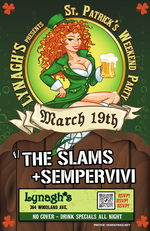
I experienced some of my favorite memories of performing original music live on stage at Lynagh’s. Lexington’s finest Irish Pub has always been good to me and my bandmates in Sempervivi. Since they are an Irish themed bar and grill, St Patricks Day is a hugely successful time of year for this bar. The Slams are a local favorite Celtic Punk style band. Therefore booking them to play with us at the pub on this occasion was a no brainer. Of course, I took on the task of drawing up the St Patricks Day poster design, so let’s dive in, shall we?
St Patricks Day Poster Design Story
I knew right away that the central image would need to feature a buxom Irish lass. Therefore, the perfect illustrated stock image portrays a luscious redhead in green leprechaun garb holding aloft a mug of foamy beer. After adding her to the composition, I wrapped the event name around the circular frame behind her. “March 19th” displays in a scrolling banner using an old English style font, while each of the band names is “stenciled” on the wooden fence our lucky lady sits on.
Additional event information also displays in a lime and dark green box at the bottom. In order to add a little flair to the dark green background, I inserted some fizzy bubbles, mimicking those founding in the beer mug. Finally, I added a solid orange shamrock shape in each corner to contrast the green and tie everything together.
Contact Me For Your St Patricks Day Poster Design
Are you planning a concert event or party at your venue for St Patricks Day? Don’t press your luck! Hire a professional graphic artist with over 20 years of experience to design your poster. Contact me today!
The library director Janet contacted me regarding this project. She needed me to turn this yoga poster design around shortly after New Years. Of course, I made time after the holidays for my long time clients.
Yoga poster design story
Janet only provided the text to include on the flyer, and the format sizes I would need to design. I had worked with the library for many years, so she trusted my instincts to create the perfect promotional material. Of course, I instantly had a concept and color scheme in mind.
Initially, I envisioned a group of silhouettes performing yoga poses. Combining these with an ornate mandala pattern hearkened back to yoga’s origins in the country of India. I didn’t want to make the yoga poster design layout too busy. Therefore, I faded the mandala into the background.
I contrasted the dark, dull blue elements against the bright orange burst background. The images stayed simple. The background however included a three dimensional pattern. I fenced all of the elements in with a dotted white frame, which also helped emphasize the sponsor logos and tagline in white. These were located at the bottom and top, respectively.
For the yoga poster design’s main title, I chose a font containing characters similar to Hindi for the word “Yoga”. The capital “Y” moved up to make it more symmetrical. I set the words “IN THE LIBRARY” in another exotic font. I warped them in a waving flag shape. This added just the right amount of motion to the title.
Janet and the rest of the library staff loved the vibrant, inspirational design. It perfectly promoted that patrons could stick to their New Years resolutions, and get fit with a new exercise program.
Contact me for your own yoga poster design
Are you promoting an event centered around yoga, or another exercise? I believe that promoting fitness in your community is very important, and I would love to help! Contact me today!
I created this ad campaign design for AVOL in Lexington, KY. It is a nonprofit which organizes AIDS volunteers. They loved the trade publication ads I made for them previously. Therefore, they contracted me for their biggest annual event campaign. For one day every September, local restaurants donate 25% of their proceeds to fighting AIDS. The organization needed a few different print sizes. These included an 11×17″ poster size and varying newspaper ad sizes, as well as bookmarks.
Ad campaign design story for AIDS benefit
Ad campaign design in marquee format at CRAVE Festival, Lexington, KY
My local chapter of the AIDS charity gave me creative freedom on this project. They only suggested a retro 1950s diner theme. They also sent a few public domain images to inspire me. These included the vintage waitress illustration I finally chose. I also redesigned their existing event logo with a new one which continued the theme. After my instructions, I poured through old 1950s ads for inspiration. Their futuristic floating shapes and pastel color palettes, as well as the kitschy mixed fonts made the cut.
I arranged these elements to suggest motion and give them a fun feeling overall. I did this by tilting text blocks and highlighting objects with different shades. A pink gradient gives shine to the restaurant and sponsor lists. The ad pieces had many moving parts, from the list of participating restaurants to information about a related art exhibit. I got creative to ensure synergy and legibility from the biggest to smallest versions.
I met the challenge of making the ad art both attractive and easy to read. Also, I crushed the deadline in plenty of time for last minute revisions. My clients raved about the finished product.
Contact me for your ad campaign design
I’ve improved the print images of many charity nonprofits and small businesses. Contact me today to join the growing list. Let’s get started with your advertising campaign!
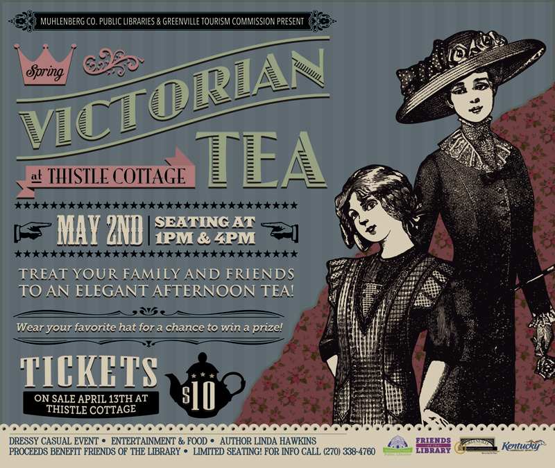
Muhlenberg County Public Libraries / Thistle Cottage
Greenville, KY
For the second year running, MCPL once again hired me to make their annual Victorian Tea poster design. I started by laying this design out in kiosk size. Then, I resized the art into several smaller formats. Half page newspaper ads were the smallest size.
Thistle Cottage holds their annual Victorian Tea in downtown Greenville, Kentucky. The party is a Victorian themed event where both mothers and daughters dress up and enjoy a traditional tea party. It is a popular event where families can go back to experience a simpler time in history that their ancestors once knew. The air of nostalgia brings little girls’ tea parties to life. Servers and staff also dress in period attire. An elegant event such as this called for an equally classy poster design.
Victorian Tea Poster Design in Kentucky
I really enjoy sifting through vintage Victorian ads. Obviously, I patterned this poster design after them. I started with the featured black and white illustration of the mother and daughter characters. The poster’s background is dressed in a “shabby chic wallpaper” pattern with the drab colors that were fashionable in that era.
My favorite feature of any good Victorian ad is the variety of fonts and dingbats in use. Artists seem to always use a dozen fonts in any given piece. It looks like the advertiser aimed to use as many fonts as possible in one space. These warped font styles often remind me of the circus. It’s as if the carnival barker pulled double duty and was also hired to design the poster layout. Both the teapot and pointing finger ornaments give the composition an old time “over the top” feel. Step right up!
Contact Me For Your Victorian Tea Poster Design
Are you hosting a retro event? Contact me today for your own poster design!
Pick it up!The Rough Customers are Lexington, KY’s only third wave ska band – as far as we know! In 2014, my band at the time Analog Apostles performed with them and Nashville, TN soul rockers Ravenhill. Ravenhill made a tour stop in Lexington at the Sidecar, next door to Al’s Bar. The Rough Customers’ live show is all about fun, and that’s the vibe I was going for with this concert poster design.
Large format concert poster design
The featured photo of the classic pin-up girl and phonograph was given a “washed out” effect, which I made by reducing the colors using Adobe Illustrator. I then added the hypnotizing bright blue swirl in the background to enhance the kitsch factor. I lettered the bands’ names in a watermelon red using the retro “Badaboom” font, since it always signals good times. Additionally, I used the “Cherry Cream Soda” font for the other text, completing the poster’s vintage 50s feel. Finally, I added a QR code to the concert poster design so that potential concert goers could RSVP to the event on Facebook by scanning the poster with their smartphones.
The Rough Customers never disappoint when they take the stage, and always draw a big crowd. This show was definitely no different, since we filled the small room to capacity. I would like to think that my eye catching design helped with that aspect. I always design and print my 11×17″ posters to promote shows and other events that I put together. The large format gives me more canvas to play with. It is also more eye catching than a letter sized flyer when hung in store windows.
Hire me to create your concert poster design
Are you a musician or band needing a concert poster design? Contact me!
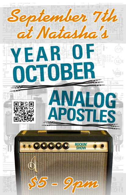
Year of October is a blues rock band based in Nashville, TN. I designed this 11×17″ concert poster art for a show with my band at the time Analog Apostles. The gig took place at the now defunct Natasha’s Bistro and Bar here in Lexington, KY. I had a lot of fun incorporating both of my loves, graphic design and music, into this composition.
Concert poster art design story
I themed the poster around a vintage Fender silverface tube guitar amp, which is similar to the ’78 Fender Twin Reverb I once owned. First of all, I replaced the Fender logo over the speaker grill cloth with AA’s “A” insignia. I added a shiny chrome effect and embossed it to mimic the original element. I also Photoshopped out the blue amp model name, and then replaced it with the words “Rockin’ Show” in a similar font. Guitar gearheads appreciated the attention to detail I added to this concert poster art.
As for the text, I used a sans serif font in turquoise for the band names, while choosing a fat script colored orange for the other information. The band name titles are colored similar to the amp name, and also use the same font. I “underlined” both bands’ names with sets of unrolled guitar cables. The orange script almost has a neon signage feel.
Finally, I overlaid a set of vacuum tubes on top of the amp schematic drawing in the background. I changed their colors to black and white to make the colors in the forefront pop. Because of this, these images come together to make the perfect background arrangement. I almost hid them in effect, but if you take the time to examine them, they really add to the whole package.
Contact me to design your concert poster art
Do you have a big show coming up and need poster graphic design that stands out? Contact me today.
The living dead returned, roaming the streets of Western Kentucky for the sequel to 2011’s Zombie Walk event! The previous year’s undead themed charity walk was a huge success. Therefore, Main Street Costumes once again called me for event promotion design. The small town costume shop printed variations of this artwork as eight feet long banners, postcards, and t-shirts.
Since this was the second annual event, I multiplied the featured zombies by two. I felt that the stock image of the purple female zombie was a tad too immodest for a family event, so I photoshopped more clothing to cover her. I also adjusted some proportions of the characters to better fit the space.
Then, I drew the red “2” so that the second event artwork would call back to 1980s slasher film sequels. The brightly colored characters and titles pop off of the stark background. I used the heavyweight Gotham font for the copy. See my work on display in this Youtube commercial for the event:
Screen printed shirt for event promotion design
I rose to the challenge of simplifying the full color poster and card designs to create a three color screen printed shirt. Since my background includes over five years of working in the screen printing industry, it was second nature to me.
My client agreed that we should reduce the art to pink and purple with white highlights. We stuck with the black background for the shirt. Black therefore functions as a de facto fourth color, outlining the words and images, and coloring hair and grunge elements.
Contact me for your own event promotion design
Are you planning a community event such as a costume party, fundraiser, or fun run 5K race? Contact me today! I will bring your vision to life.
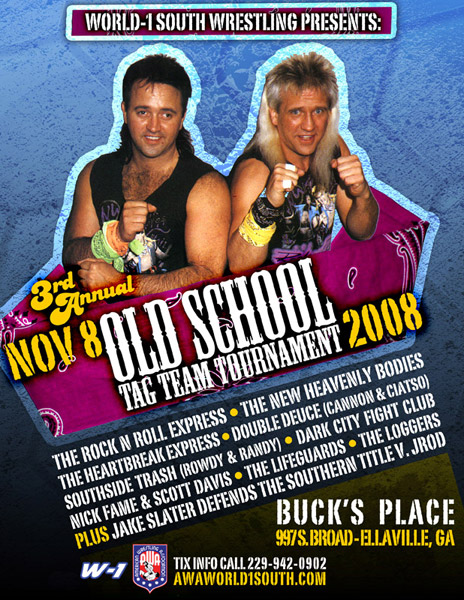
Ramma-lamma-lamma – Rock n’ Roll is King! It is always fun when I have a project that involves one of my outside interests. Whether it’s designing band merchandise such as one-inch buttons, or a wrestling poster design such as this one, I always have an edge because of my passion for the subject matter.
Years ago, the AWA pro wrestling promotion was once one of my main clients. During this time, the AWA was divided into several regional offices in the USA run by independent promoters. The Georgia based World-1 South group hired me to create this poster for an upcoming event in Ellaville. A tournament featuring 80s stalwart tag team stars the Rock n’ Roll Express was the main event of the evening.
Old school pro wrestling poster design
I poured through a few of my old coffee table wrestling books to find the perfect old photo to feature. Ricky and Robert are putting their dukes up, ready for action. Then I scanned in an old bandanna to frame in the classic babyface team. My actual bandanna was turquoise, but I recolored it pink to make it pop over the blue grunge background. I used the Mesquite “Wild West” style font for the main title “Old School Tag Team Tournament”, and a grunge stamp style font throughout for a strong, masculine feel. The vintage disco style font for the words “3rd Annual” tops the design off with a flamboyant flair. Finally, I tilted the elements in the foreground to help the art catch a few more eyes.
Hire me for your wrestling poster design
We made a big hit with this new school take on an old school design. Are you a promoter with an upcoming wrestling or sports event? You need a professional poster design! Tag me in and we’ll make history together!
 Lynagh’s Irish Pub
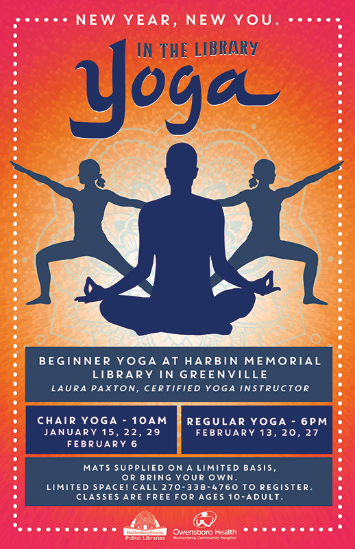 Muhlenberg County Public Libraries
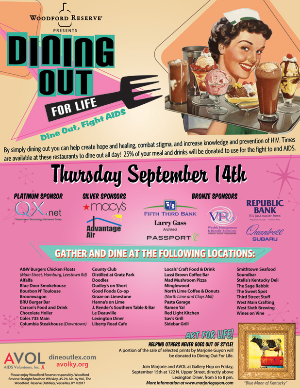 AVOL
AVOL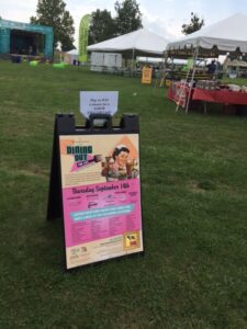
 Muhlenberg County Public Libraries / Thistle Cottage
 Year of October
 AWA World-1 Wrestling