 Resolute Repairs Logo
Lexington, KY
My neighbor Drew was starting up his own home repair business. It just so happened that I needed some repair work done on my home. As luck would have it, he also needed a contractor logo design for his company. We struck up a barter deal for each of our respective services, then we both got to work!
Contractor logo design story
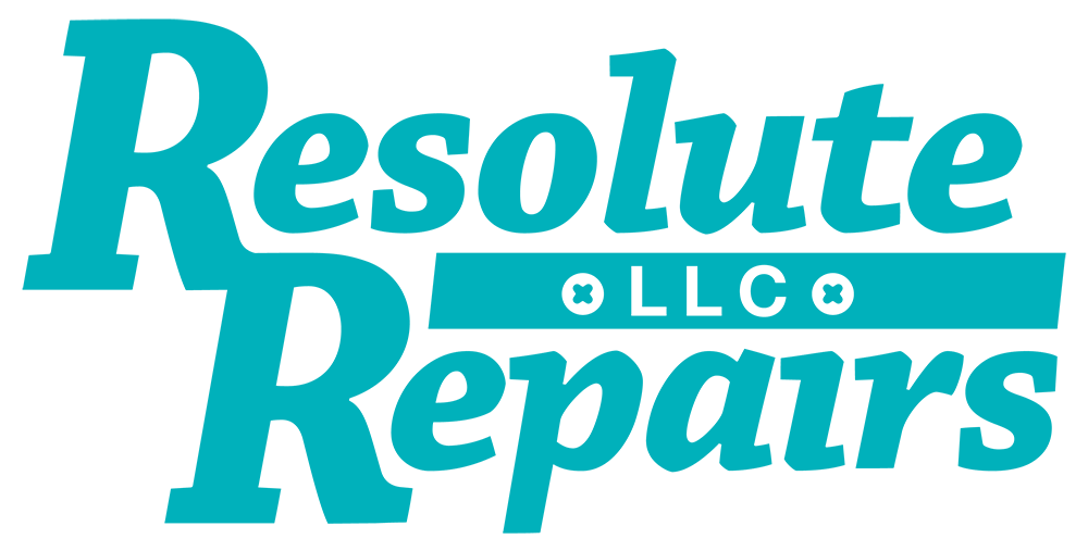
Drew and his partner Daniel wanted to represent their brand with a simple, classic mark. Specifically, they wanted art that was text based, with subtle image elements. They needed big, bold art that got right to the point, but did not have any specific font or element in mind. Rather, they desired a specific turquoise shade. I used this information to draw up a series of comps.
Out of all of my sketches, Drew chose the version with a simple italicized, bold serif font. Inside the line separating the two words, I reversed out “LLC” in the ubiquitous Helvetica Bold font. On either side of that, I placed circular Phillips head screw shapes. These subtle elements reinforce the home repair business category. The right screw shape also implies a dot on top of the lowercase “i” in the word “Repairs”.
Finally, the capital “R”‘s in each of the words connect. The company could use this separate mark in alternate branding applications, from uniform embroidery to vehicle wraps. I was happy with the drywall work performed by my new client. Drew and Daniel were thrilled with their new contractor logo design. Win/win!
Contact me today for your contractor logo design
The word “resolute” is a synonym for “determined”. Whether it comes to your print or web image, I am resolute to help you to look your best. Does your company need a contractor logo design? Send me a message today.
 Wolfe County Public Library
Campton, KY
This Eastern Kentucky reference center commissioned a library logo design and website package. My clients at Muhlenberg County Public Libraries recommended me. I previously had also provided a logo and website for them.
Traditional style green library logo design
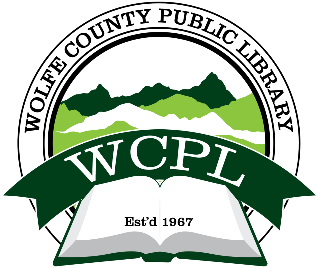
The library board did not request very many specifics at first. They needed a strong, traditional mark incorporating shades of green. Therefore, Wolfe County’s staff chose the tried and true “donut” ring format from my initial mock up sketches. If it’s good enough for Starbucks, then it’s good enough for my clients. I selected the classic and strong Clarendon font to use throughout the library logo design. A serif font such as Clarendon is always a winner in applications like these. After that, I then wrapped the text “Wolfe County Public Library” around around the ring frame. Outline strokes of varying thicknesses in the ring helped give the mark a subtle uptown feel.
The arched ribbon that reads “WCPL” is the focus element, and also suggests a bookmark. The opened book in front of the ribbon creates depth and perspective. A simple “Est’d 1967” in front of the book reminds viewers of the library’s staying power in the community.
Finally, I topped the design off with the green and white mountains sprawling in the background. These elements are a nod to the beautiful mountains and hollers in Eastern Kentucky. WCPL ordered several tweaks and revisions as we went along. In the end, however, the library board were very happy with the finished product. It was time to move on to their website design.
“Book” me to design your library logo design
Are you a public library coordinator? Do you run a small business or nonprofit? Do you need a strong, traditional mark to represent your brand? Contact me today.
 Iron Will Fitness Studio
Lexington, KY
I designed this fitness logo for a new workout studio startup based here on the South side of Lexington, KY. The owner was up against a tight deadline to open his first location. Luckily for him, tight deadlines are my specialty! I was up for the challenge and we worked closely together to bring his original sketch to life. His mark was ready with time to spare, gracing the signage at his independent gym’s grand opening.
Iron Will Fitness Studio’s logo displayed on their Lexington, KY storefront
Fitness Logo Design for Kentucky Gym Brand
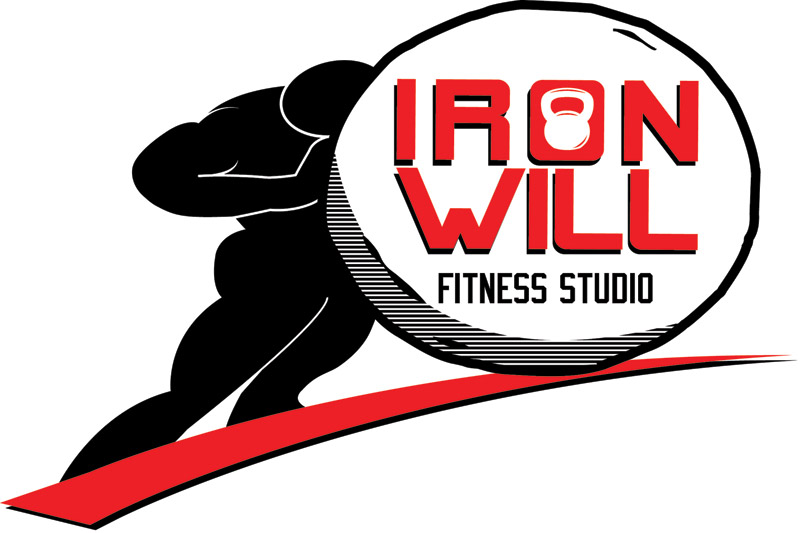
The client provided me with a rough sketch of the Greek mythological figure Sisyphus pushing his fabled boulder up a hill. I thought that was a great representation of building strength through repetition. The original drawing suggested a simplified shadowy figure, so I made the hill a simple “swoosh”, and shaded the boulder with straight black lines.
I chose a modern sans serif and varsity combination to suggest a simple, quick to the point philosophy, while nodding to the athletic clientele. Then I colored the high contrast logo in a black, white, and red combination. You don’t get more clean or powerful than that.
Finally, the simple kettlebell weight silhouette as the negative space in the “O” puts a nice finishing touch on the mark. There is no mistaking that this fitness center is where you go to build strength and become your personal best. The client wanted to keep his options open, so I also provided him with a few other color combinations. As with all of my logos, I Pantone color matched each version. This ensures that the colors display the same, no matter what the application. Find out more about Iron Will Fitness Studio at their website.
Contact me for your own fitness logo design
Are you opening up a new gym? Perhaps you need to rebrand your existing fitness center. Contact me so we can get started.
 Big Blue Customs
Lexington, KY
Regular client Chris Curtis, owner of the Chip Magician body shop, started taking on more custom work in 2010. Because of this, he decided to launch a new brand around it. I created this hot rod logo design for him based on a pencil sketch he had drawn up by a third party. Chris needed a masculine, powerful image to represent his brand. The end result needed to retain the attitude of the original sketch, while pumping it up with extreme shine.
Hot rod logo design story
First, I started by tackling the color scheme. Here in Lexington, Kentucky everyone bleeds UK Wildcats blue, so I Pantone matched that particular shade for this design’s background. The warped varsity style block lettering in white makes that theme obvious enough. It pairs perfectly with the word “Customs”, appropriately set in a custom font below it. The words are stroked multiple times and shadowed, as is the background. This adds just the right amount of over the top boldness.
Behind the words and background, I added an image of a custom chrome wheel. There is no doubt when you see this that the business caters to an audience who is passionate about customizing their cars. I then framed the wheel at the bottom using two tribal ornaments that subtly suggest flames. Throughout the design, I embellished with chrome effects, gradients, shadows, as well as inner and outer strokes to grab the viewer’s attention.
Finally, I added in some extra bling to the corners of the word “CUSTOMS” for maximum shine. There you have it – one high end, hot rod logo design!
Start your engines! Hire me for your hot rod logo design
If you’re looking for a bold, chromed out logo for your business, then I am your man. Contact me today to get started!
 Turnaround Tour
Bowling Green, KY
Gary Gunn was a long time employer and later a freelance client who coached independent automotive repair shop owners. When I worked with him full time, he had me redesign his website, as well as his brands’ logos. Honor Circle was his premium monthly business coaching program. Here is the story of this consulting logo design.
Consulting logo design story
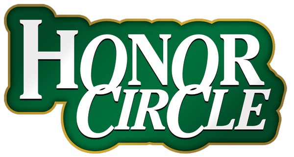
Since this program catered to Gary’s highest paying clients, I set out to convey a high-class feel. As such, the main color needed to be green, the color of money! I chose a thick sans serif font to communicate that this was an exclusive brand.
I altered the word “Honor” by stylizing the H, extending the left side stems on both the top and bottom. Then, I made the O’s italic to further make it stand out. They overlap with the C’s in such a way that they are “circling” one another. I italicized the entire word “Circle”. This differentiates it from “Honor” and adds more forward motion to the consulting logo design. A drop shadow makes the white text pop even more. I created the dark to light gradient background by first outlining the text with a thick stroke. I added a subtle light to dark gradient and an inner shadow. These create depth and shine to further enhance the image.
Finally, I topped off the design with a golden stroke outline. I solidified the outline and added a gradient shine to it as well. The end result is a mark that attracted the choosiest auto repair shop owners who were committed to investing in their businesses.
Hire me for your consulting logo design
Are you are rolling out a new program for your coaching business? Then you will need a high end logo that represents the quality of your brand! Contact me today and make it happen.
 The Gagne Group
Rochester, MN
The chairman of this entertainment booking company had worked with me on several projects before. For this new project, he requested a classy, sturdy mark to represent his brand. The right booking logo design is extremely important to establish a company’s image.
Booking logo design story
We met several times to brainstorm the right image. During our meetings, my client decided on a logo hearkening back to Greco Roman fonts and architecture. The popular Trajan Pro serif font nails the look he desired. It is a familiar. Everyone uses it. However, it is a timeless go-to font. The word “The” on the top gives the mark a touch of modern class, since it is set in the LHF Tideway Script. I then embossed all of the logo lettering so as to give it a chiseled effect. That effect, along with the the brown stroke, make the yellow text appear gilded.
Finally, I added a subtle shadow that gives the words depth. After I finished my work on the fonts, I focused on the background shape. It is a mix between a roof and a shield, rounded at the bottom. The “roof” invokes images of the Parthenon, as well as many other classical structures. I styled the background with a pattern of grey clouds. This pattern simulates marble. I also added an inside stroke emboss to give it more depth and a high end engraved feel. Perfect for a booking logo design.
Last of all, I added an outside stroke, shadow, and a white overlay to give it a glossy shine. The final product pleased my client, to say the least. In addition to the full color logo with effects, I also included a simple black and white version. I always provide my customers with files for any application. Whether you need to use your logo on uniforms, print ads, or billboards, I have you covered.
Hire me for your booking logo design
You run a high end booking agency. Your brand’s image needs to reflect the discerning taste of your roster and clients. Contact me today to get started.
