 Al’s Bar
Lexington, KY
Funko Pop poster design “Josh” variant
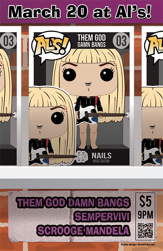
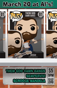
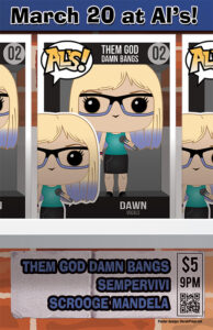
My punk band Sempervivi scheduled a local show at the fabled Al’s Bar on the date March 2020. Some bands we were friends with based in Lexington and Louisville also joined on the bill. I blocked off some time in between my clients’ projects to draw up a special poster for this event. Since Josh, the singer and guitarist from Them God Damn Bangs, was an emphatic collector, I decided to create a Funko Pop poster design. This would be an ambitious effort that would allow me to flex my creative muscles and try some new techniques. Also, it was the first poster I had ever planned multiple variants for, so I was excited to spend all the time I could on it.
Funko Pop poster design story – base toy and package templates
I began this printed poster project by seeking out Funko Pop templates. Fans can go to Funko’s website to create their own avatars in the form of these vinyl collectibles. First, I worked up base images for the three most visible members of the band, Dawn, Josh, and Nails. These images were low resolution images, which also did not include the packaging templates. Most collectors prefer to display their Pops in the boxes on their shelves, rather than taking the toys out of them. Because of this fact, I also sought out packaging templates to start recreating the boxes.
Once I found the right packaging and toy templates to base my work on, I began adding little details to further personalize the flyer. First, I added the band name, along with the member names and their roles to the packaging, using the Bebas sans serif font in different weights and styles. I numbered each box 01-03, and parodied the word “POPS!” in the top left corner with the word “AL’S” for the venue. A grey background added the illusion of depth, and a faint, transparent grey simulated the clear portion of the packaging.
Each of the band members needed their own accessories and outfit modifications for authenticity. For instance, Nails and Josh play very distinct instruments. While I did not aspire to reproduce every single tattoo and nuance of their appearances, they had to be easily recognizable.
Adding some personalization to the figures
Nails usually plays a white Eastwood bass guitar, modeled after the vintage Univox Hi-Flyer. Since this is not as widely played as popular models like the Fender Jazz Bass or the Ernie Ball Stingray, I could not find any vector images for it online. I started with a photograph of the instrument, and drew up a simple approximation of it using Adobe Illustrator.
In addition to her bass, I added details of Nails’ personal style. This included adding the brown lowlights to her hair, as well as her lip and nose piercings. Her red star tattoos line her left eyebrow. Considering that Funko Pop vinyl figures do not include mouths, I find it funny that her non-existent lip is pierced.
Funko Pop poster design “Dawn” variant
Since Josh is the biggest Funko Pop enthusiast in the Lexington music scene, getting his figure mods perfect was the most important of the three. Josh often plays a very rare orange Fender Cyclone II onstage. While I was able to find a simple outline of the model, I needed to edit it and add several details in order to make it authentic. From the correct shade of orange to the Fender logo, I had to make it just right.
Dawn’s figure, on the other hand, was easier. I added her signature purple to both her hair and her glasses. Then, I added a zipper and some bling to her black mini skirt. Finally, I redrew her arms so she could hold a microphone.
Funko Pop poster design story – finishing touches
The time came to put the finishing touches on the poster. I added the event details to a sticker affixed to the red brick wall background. I created the sticker effect from scratch. A mixture of Adobe Photoshop filters and effects made it appear worn and peeled up.
Each poster design variant boasts its own distinct, bright color for the banner at the top, as well as the band names at the bottom. Dawn’s poster used a bright shade of blue. Josh’s info appeared in Starbucks green, while Nails’ design featured a purplish pink hue. I typed all of the information in the fun, kitschy Ad Lib font.
I copied each band members’ figure boxes. Then, I set them three in a row on a white shelf bolted into the brick wall. I cropped the left and right boxes off of the canvas. I did this so the center image could be as large enough to feature it.
Unfortunately, due to the Coronavirus outbreak, this show was cancelled, along with all other mass gatherings in America. The COVID-19 virus changed everyone’s lives worldwide. Specifically, it caused a speed bump for independent musicians needing live performances to fund their endeavors. Unfortunately, the posters could not attract concert goers to the event. At least I got a cool poster design to feature on my portfolio.
Contact me for your own Funko Pop poster design
Can I interest you in featuring a collectible toy motif on your promotional piece? I can add the “pop” you need to attract potential your audience’s attention. Contact me today so we can get to work on some serious fun!
 Pedestryans
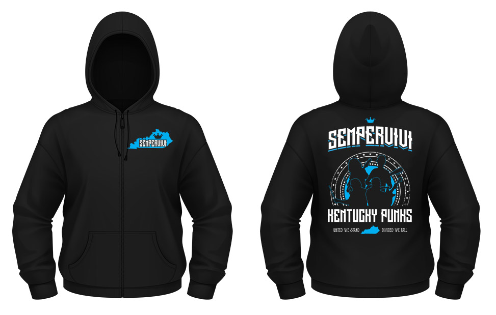 Sempervivi


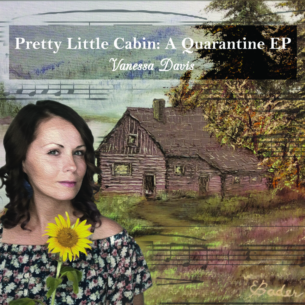 Vanessa Davis
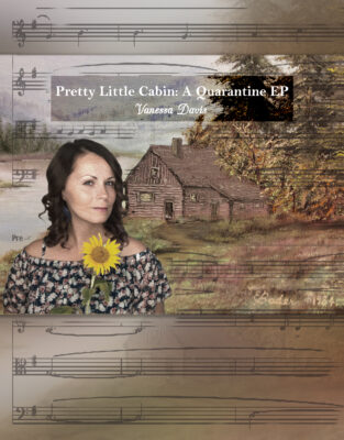
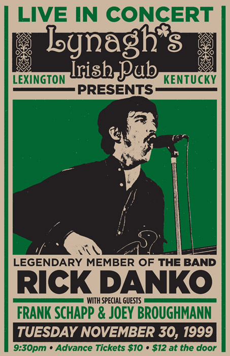 Lynagh’s Irish Pub
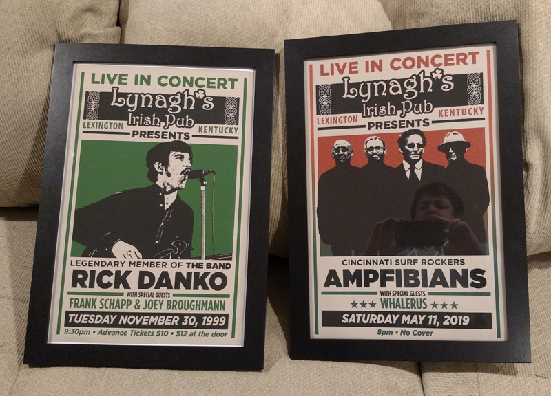
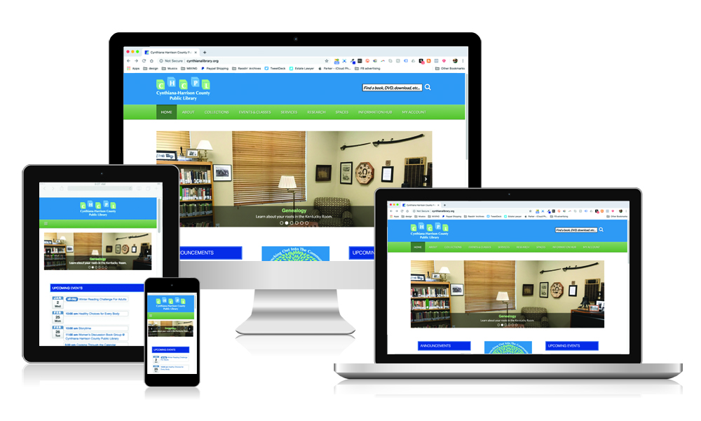 Cynthiana Harrison County Public Library
 Local Violence
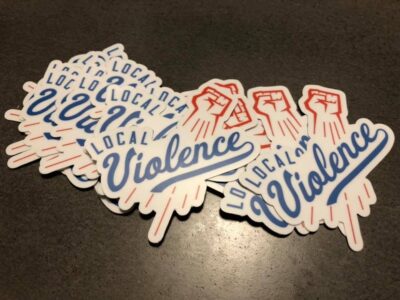

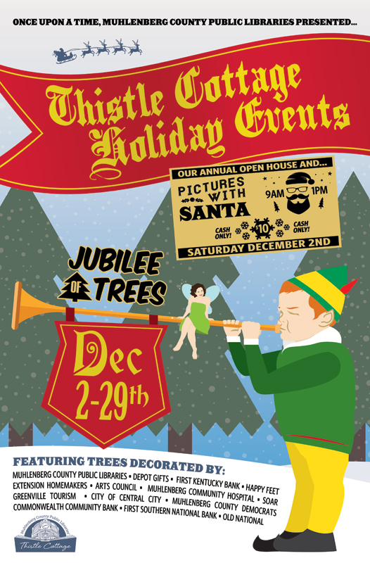 Muhlenberg County Public Libraries
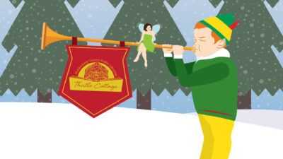
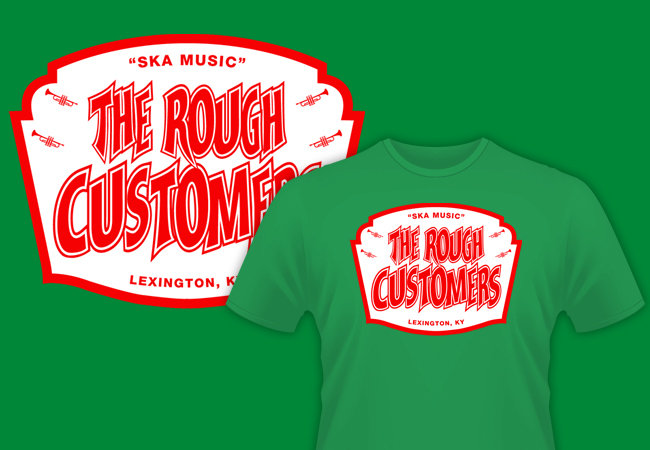 The Rough Customers
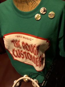
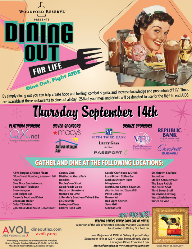 AVOL
AVOL
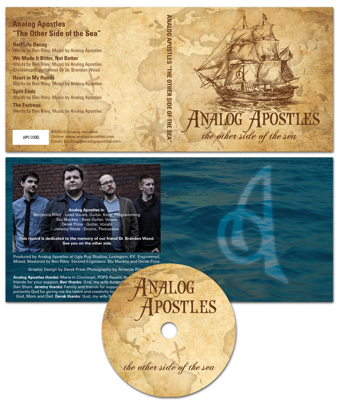
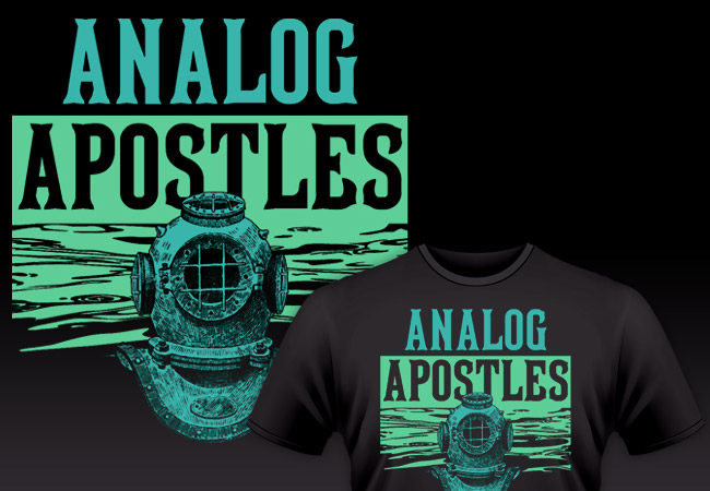 Analog Apostles
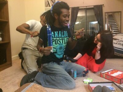
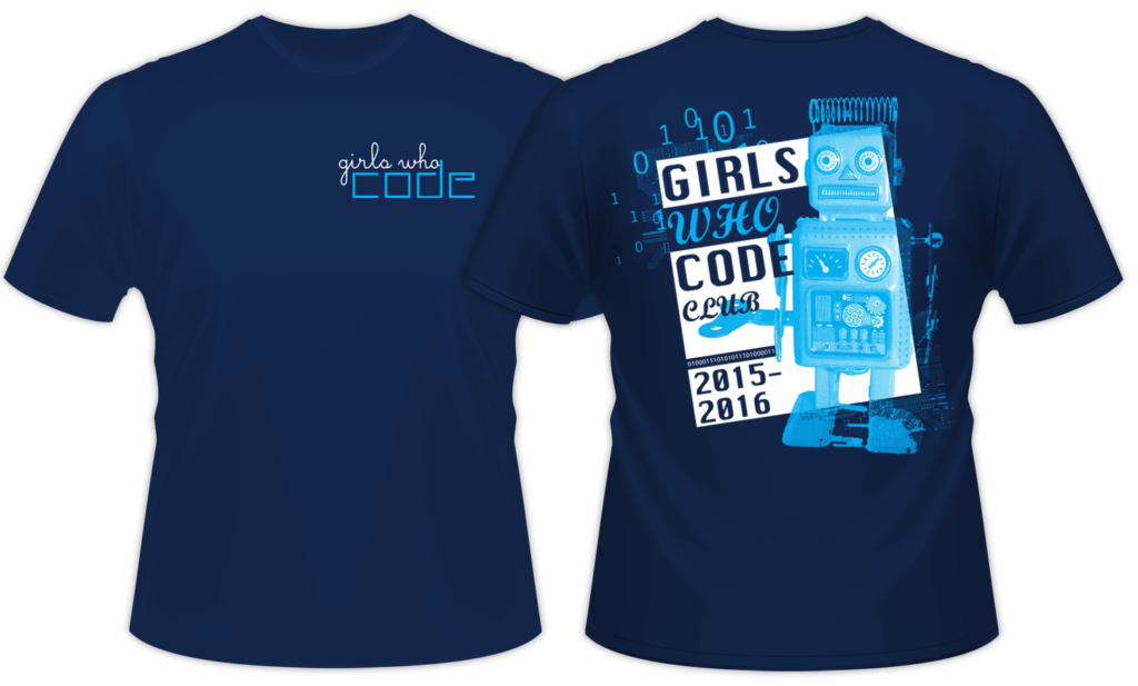 Girls Who Code
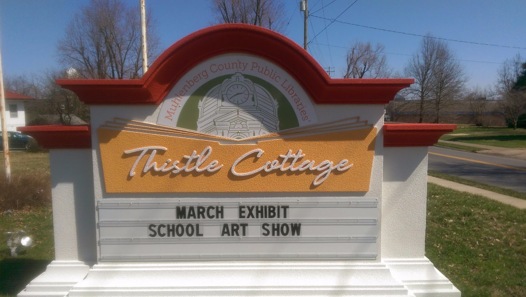
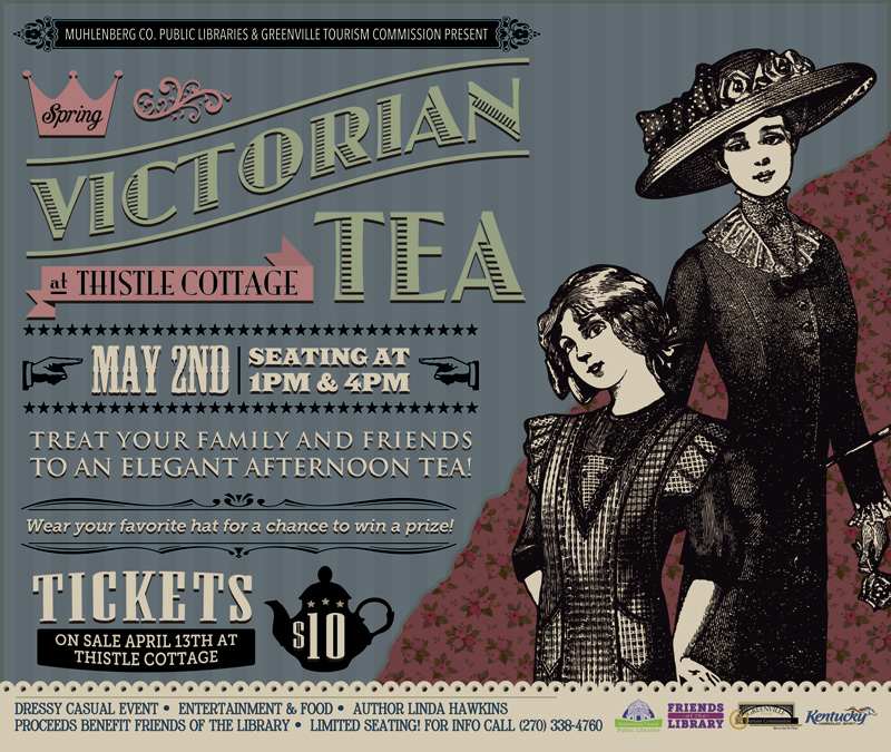 Muhlenberg County Public Libraries / Thistle Cottage


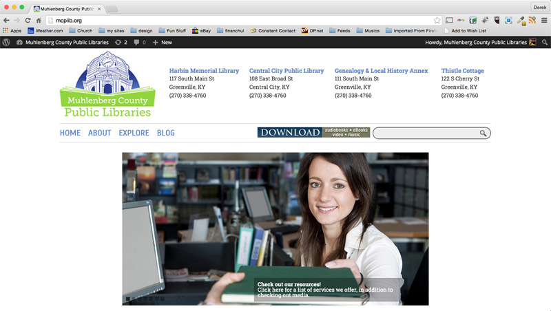 Muhlenberg County Public Libraries


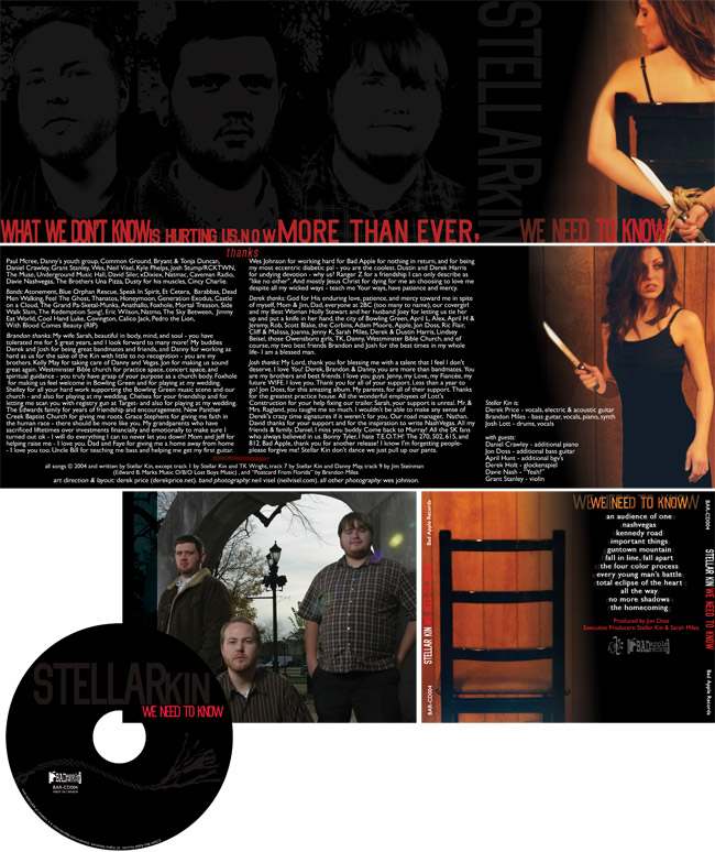 Stellar Kin
 Clash City Rockers
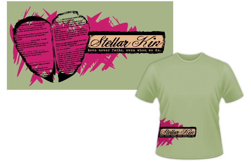 Stellar Kin
 Dogwood Lakes Camping Resort
 The Brothers Pizza