 Pedestryans
Lexington, KY
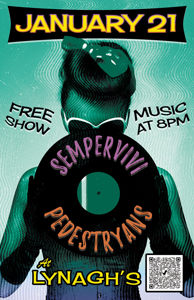
Here’s a retro concert poster that I designed for a 2022 show at Lynagh’s Irish Pub in Lexington. My friend Destry is a classy lady who sings and plays guitar in the blues based alternative rock band Pedestryans. Her selfie game is on point, and she often rocks a variety of vintage styles, so I thought featuring a classic 1950s style pin up girl would fit.
Retro Concert Poster Story
When I chose the vintage style pin up girl photo from my extensive stock image collection, I knew that I wanted to bathe it in an aqua blue tint. I overlaid the whole image with a wavy “static” pattern, so as to imitate vintage TV interference. Also, I envisioned wrapping the band names around the black vinyl record that she is holding. The bright pink and orange hues of the names help them stand out over the wax circle.
For the date at the top, I manually jumbled the letters in order to give it a retro, playful feel. I also jumbled the letters at the bottom of the page that spell out the venue name. The bright yellow date is encased in a typical 50’s “futuristic” style black curved shape. I then added a subtle gradient that fades the aqua blue to purple at the bottom in order to highlight “At Lynagh’s”. Other event information floats to the left and right of the pin up girl in black. I added a wave warp effect to it in order to give it some movement and also to increase the kitsch factor.
Contact Me If You Need A Retro Concert Poster
Are you holding an event that would benefit from a retro concert poster design? I love incorporating vintage 1950s elements into promotional ads! Contact me today to get started.
 Muhlenberg County Public Libraries / Thistle Cottage
Greenville, KY
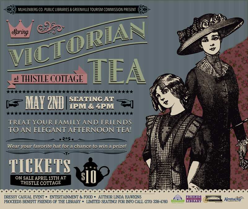
For the second year running, MCPL once again hired me to make their annual Victorian Tea poster design. I started by laying this design out in kiosk size. Then, I resized the art into several smaller formats. Half page newspaper ads were the smallest size.
Thistle Cottage holds their annual Victorian Tea in downtown Greenville, Kentucky. The party is a Victorian themed event where both mothers and daughters dress up and enjoy a traditional tea party. It is a popular event where families can go back to experience a simpler time in history that their ancestors once knew. The air of nostalgia brings little girls’ tea parties to life. Servers and staff also dress in period attire. An elegant event such as this called for an equally classy poster design.
Victorian Tea Poster Design in Kentucky
I really enjoy sifting through vintage Victorian ads. Obviously, I patterned this poster design after them. I started with the featured black and white illustration of the mother and daughter characters. The poster’s background is dressed in a “shabby chic wallpaper” pattern with the drab colors that were fashionable in that era.
My favorite feature of any good Victorian ad is the variety of fonts and dingbats in use. Artists seem to always use a dozen fonts in any given piece. It looks like the advertiser aimed to use as many fonts as possible in one space. These warped font styles often remind me of the circus. It’s as if the carnival barker pulled double duty and was also hired to design the poster layout. Both the teapot and pointing finger ornaments give the composition an old time “over the top” feel. Step right up!
Contact Me For Your Victorian Tea Poster Design
Are you hosting a retro event? Contact me today for your own poster design!
 Year of October
Nashville, TN
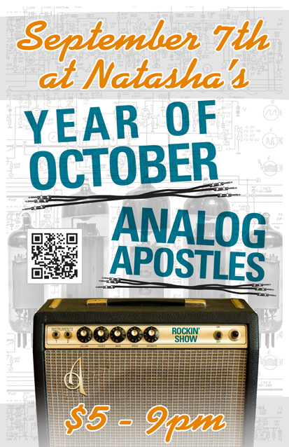
Year of October is a blues rock band based in Nashville, TN. I designed this 11×17″ concert poster art for a show with my band at the time Analog Apostles. The gig took place at the now defunct Natasha’s Bistro and Bar here in Lexington, KY. I had a lot of fun incorporating both of my loves, graphic design and music, into this composition.
Concert poster art design story
I themed the poster around a vintage Fender silverface tube guitar amp, which is similar to the ’78 Fender Twin Reverb I once owned. First of all, I replaced the Fender logo over the speaker grill cloth with AA’s “A” insignia. I added a shiny chrome effect and embossed it to mimic the original element. I also Photoshopped out the blue amp model name, and then replaced it with the words “Rockin’ Show” in a similar font. Guitar gearheads appreciated the attention to detail I added to this concert poster art.
As for the text, I used a sans serif font in turquoise for the band names, while choosing a fat script colored orange for the other information. The band name titles are colored similar to the amp name, and also use the same font. I “underlined” both bands’ names with sets of unrolled guitar cables. The orange script almost has a neon signage feel.
Finally, I overlaid a set of vacuum tubes on top of the amp schematic drawing in the background. I changed their colors to black and white to make the colors in the forefront pop. Because of this, these images come together to make the perfect background arrangement. I almost hid them in effect, but if you take the time to examine them, they really add to the whole package.
Contact me to design your concert poster art
Do you have a big show coming up and need poster graphic design that stands out? Contact me today.