I experienced some of my favorite memories of performing original music live on stage at Lynagh’s. Lexington’s finest Irish Pub has always been good to me and my bandmates in Sempervivi. Since they are an Irish themed bar and grill, St Patricks Day is a hugely successful time of year for this bar. The Slams are a local favorite Celtic Punk style band. Therefore booking them to play with us at the pub on this occasion was a no brainer. Of course, I took on the task of drawing up the St Patricks Day poster design, so let’s dive in, shall we?
St Patricks Day Poster Design Story
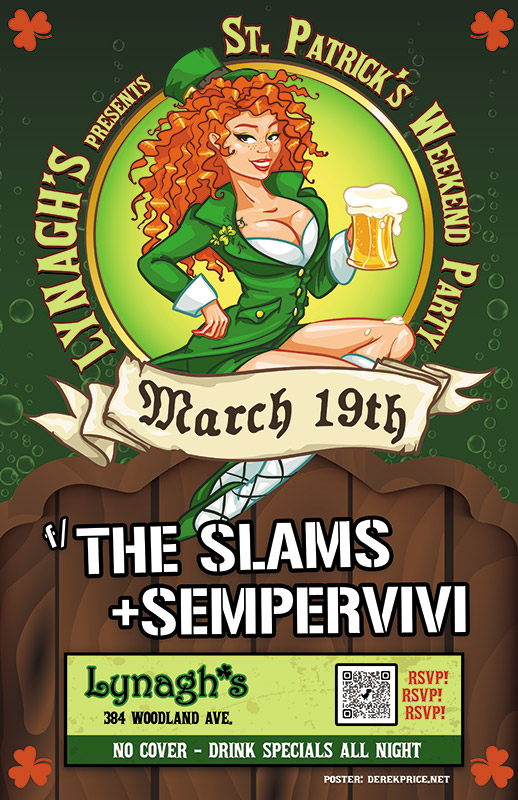
I knew right away that the central image would need to feature a buxom Irish lass. Therefore, the perfect illustrated stock image portrays a luscious redhead in green leprechaun garb holding aloft a mug of foamy beer. After adding her to the composition, I wrapped the event name around the circular frame behind her. “March 19th” displays in a scrolling banner using an old English style font, while each of the band names is “stenciled” on the wooden fence our lucky lady sits on.
Additional event information also displays in a lime and dark green box at the bottom. In order to add a little flair to the dark green background, I inserted some fizzy bubbles, mimicking those founding in the beer mug. Finally, I added a solid orange shamrock shape in each corner to contrast the green and tie everything together.
Contact Me For Your St Patricks Day Poster Design
Are you planning a concert event or party at your venue for St Patricks Day? Don’t press your luck! Hire a professional graphic artist with over 20 years of experience to design your poster. Contact me today!
The library director Janet contacted me regarding this project. She needed me to turn this yoga poster design around shortly after New Years. Of course, I made time after the holidays for my long time clients.
Yoga poster design story
Janet only provided the text to include on the flyer, and the format sizes I would need to design. I had worked with the library for many years, so she trusted my instincts to create the perfect promotional material. Of course, I instantly had a concept and color scheme in mind.
Initially, I envisioned a group of silhouettes performing yoga poses. Combining these with an ornate mandala pattern hearkened back to yoga’s origins in the country of India. I didn’t want to make the yoga poster design layout too busy. Therefore, I faded the mandala into the background.
I contrasted the dark, dull blue elements against the bright orange burst background. The images stayed simple. The background however included a three dimensional pattern. I fenced all of the elements in with a dotted white frame, which also helped emphasize the sponsor logos and tagline in white. These were located at the bottom and top, respectively.
For the yoga poster design’s main title, I chose a font containing characters similar to Hindi for the word “Yoga”. The capital “Y” moved up to make it more symmetrical. I set the words “IN THE LIBRARY” in another exotic font. I warped them in a waving flag shape. This added just the right amount of motion to the title.
Janet and the rest of the library staff loved the vibrant, inspirational design. It perfectly promoted that patrons could stick to their New Years resolutions, and get fit with a new exercise program.
Contact me for your own yoga poster design
Are you promoting an event centered around yoga, or another exercise? I believe that promoting fitness in your community is very important, and I would love to help! Contact me today!
Pick it up!The Rough Customers are Lexington, KY’s only third wave ska band – as far as we know! In 2014, my band at the time Analog Apostles performed with them and Nashville, TN soul rockers Ravenhill. Ravenhill made a tour stop in Lexington at the Sidecar, next door to Al’s Bar. The Rough Customers’ live show is all about fun, and that’s the vibe I was going for with this concert poster design.
Large format concert poster design
The featured photo of the classic pin-up girl and phonograph was given a “washed out” effect, which I made by reducing the colors using Adobe Illustrator. I then added the hypnotizing bright blue swirl in the background to enhance the kitsch factor. I lettered the bands’ names in a watermelon red using the retro “Badaboom” font, since it always signals good times. Additionally, I used the “Cherry Cream Soda” font for the other text, completing the poster’s vintage 50s feel. Finally, I added a QR code to the concert poster design so that potential concert goers could RSVP to the event on Facebook by scanning the poster with their smartphones.
The Rough Customers never disappoint when they take the stage, and always draw a big crowd. This show was definitely no different, since we filled the small room to capacity. I would like to think that my eye catching design helped with that aspect. I always design and print my 11×17″ posters to promote shows and other events that I put together. The large format gives me more canvas to play with. It is also more eye catching than a letter sized flyer when hung in store windows.
Hire me to create your concert poster design
Are you a musician or band needing a concert poster design? Contact me!
Misty Mountain String Band’s banner design on display at a show.
After designing MMSB’s CD layout for “Went to the Well”, the band returned, asking me to create a large banner design. This three foot by five foot vinyl banner travels with the band and helps the boys look professional when on stage.
Banner design for Kentucky bluegrass and folk band
The affable string band sound describes their sound as “What it sounds like when a banjo smiles.” Similarly, this banner is both warm and inviting. The large banner layout features text and ornaments arranged in a vintage two color “show poster” style. First, I set the stage with a neutral color background with a rough burlap texture. I then mixed the two big, bold fonts for the main title in bright orange.
Afterward, I reversed the words “Misty Mountain” out of a long orange block using a Western style font. This is a divider in the middle of the main title to break the banner design up visually, and it function as ground for the squirrels to stand on. I set the rest of the band’s name in a heavy sans serif style font. I randomly nudged the position of some of the letters in order to give the title the appearance of being manually screen printed by a letterpress such as Nashville’s Hatch Show Print.
After that, I added the band’s requested twin squirrel and banjo line drawings in a bold, dark green. This gives the overall design a natural feel with more weight. Finally, I added some distress to the entire banner design composition using a grunge pattern eraser. How much more bluegrass can you get? The answer is none – none more bluegrass!
Graphics for your concert promotional banner design
Are there big summer music festival bookings in your future? Do you need a large banner design to make your group look more professional on stage? Contact me today to get started!
I created this newspaper ad design series while working for Dogwood Lakes Camping Resort in Dunmor, KY. The long beloved Western Kentucky campground held annual motorcycle rallies and concerts during my time working as their in-house Graphic Designer. Dogwood Lakes also held smaller community events such as yard sales. Holiday parties and haunted houses also became popular. The campground had grown in recent years, so my employers let me design these ads to promote their upcoming events. The Greenville Leader News and the Central City Times Argus local papers featured the ads.
Newspaper ad design for clients in Kentucky
My coworker Ricardo Lowenstein conceived the adorable Top Dog character. He provided a total of four posed illustrations for me to use in the ads. I then dressed the pooch up in Photoshop to fit the themes of these events. Top Dog portrayed a motley crew of characters that included a vampire, Uncle Sam, a jolly pirate, and a mariachi singer. He rode in a go cart for Memorial Day, hawked a velvet Elvis painting for the yard sale event, flew a kite, and munched on a yummy chocolate bar.
Other designers probably would have have considered the black and white newspaper format to be a limitation. However, I chose to look at it as a challenge. Without colors, I still used the elements I had on hand to create vibrant and fun advertisements. The ads were so successful in getting the word out in the communities of Muhlenberg and Logan Counties that we had some huge turnouts for the events. I always have fun reimagining characters in different scenarios in order to breathe new life into them.
 Lynagh’s Irish Pub
 Muhlenberg County Public Libraries


