Analog Apostles
Lexington, KY
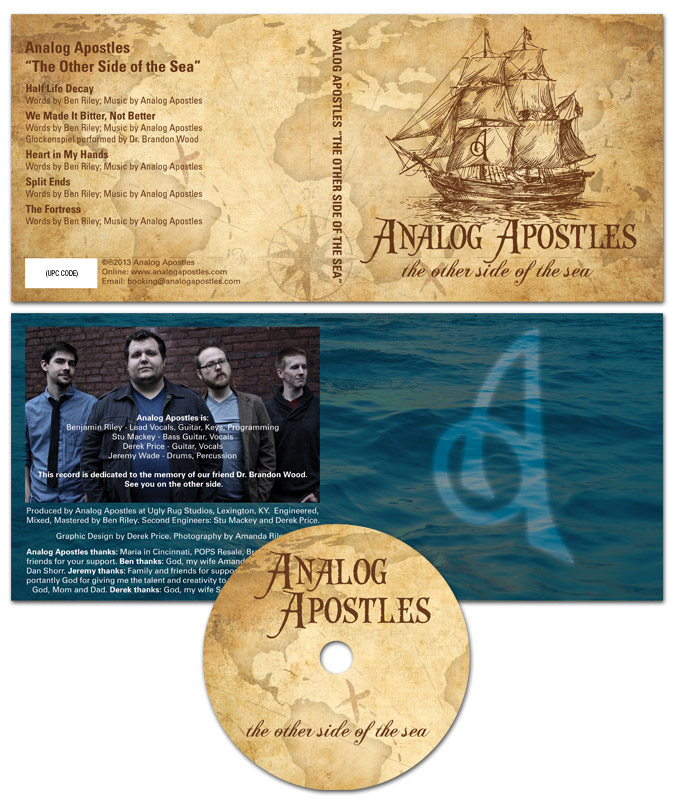
I designed this CD art for Lexington, KY alternative rock band Analog Apostles‘ debut EP “The Other Side of the Sea”. Since I played lead guitar in the band at the time, it was a no brainer for me to do the artwork. I was also very involved in the music production side.
Ben, the main songwriter and rhythm guitarist, thought of the title long before we recorded the first note. The album name and many of the songs made references to water, so we decided together on a nautical theme.
CD art – setting sail for the high seas
The four panel digipak layout started with an antique style treasure map background. Then, I overlaid a classical pirate ship illustration in brown as the focal point. The “A” monogram mark from the logo I designed was later superimposed onto the ship’s main sail.
After that, I set the band‘s name in an antique “swashbuckling” style font face. The album’s title then materialized in a classic cursive script. I capped off the design with a ghostly image of the band’s “A” icon over the dark blue ocean background in the tray card. Since the record’s theme suggested high adventure, a hint of supernatural mystery put it over the top.
From start to finish, this record truly was a DIY project. We performed every aspect of the production, from the recording process to ordering the album duplication. Ben’s wife Amanda did a great job with the posed band photography. Our fan base fully funded the CD’s production online via Indiegogo, which is a great fundraising tool for artists on a budget.
Hire me to design your CD art
Are you a band or record label currently hoisting the main sails on a new album? Contact me today for a CD layout design that will shiver your fans’ timbers.
 Nathan Morris
“The Say Something EP”
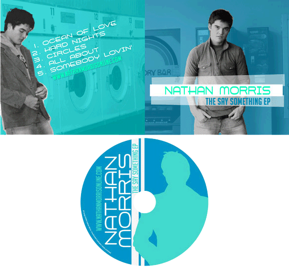
Singer songwriter Nathan Morris is an old friend who hails from Owensboro, KY. I designed this CD slip layout, which he used for his 2004 debut EP. Since “Natmo” dug the previous stickers and pop album art design I’d made for him, he hit me up again to create this CD art.
Pop album art design story
First, Nathan supplied me with the posed photography from a session he had taken at a local laundromat. His only directions to me were to keep it simple. He instructed me to use a color scheme that was both minimal and cool. I combined a mint green shade with a dark sky blue in order to achieve the effect.
First, I converted the front and back photos to black and white. Using Adobe Photoshop, I then cut out Nathan from the backgrounds. I did it in a sloppy, imprecise manner to give it a homemade, DIY feel. By keeping Nathan in black and white, while colorizing the background behind him, I made his image a focal point that really popped. This is ideal to introduce a solo artist via pop album art design.
Throughout the design, I used a combination of two fonts. The main title font has a feel that can only be described as retro futuristic. I supplemented it with one of my favorite fonts, the tall and bold face Big Noodle Titling. At the suggestion of my then-roommate Adam, I tilted the song title list on the back at the same angle that Nathan is leaning against the wall at. I also tilted the main title text on the front of the CD slip, displaying it on top of white strips which mimic electrical tape. Finally, I simplified another photo of Nathan to make a silhouette on the CD face itself. I repeated the white strips as a 90 degree border, and also turned the text itself on it’s side.
Contact me for your pop album art design
Are you an independent musician who is in need of the perfect pop album art design? Why not contact me today? You already have a record that perfectly represents your sound. I’ll make you look your best, too.