 Pedestryans
Lexington, KY
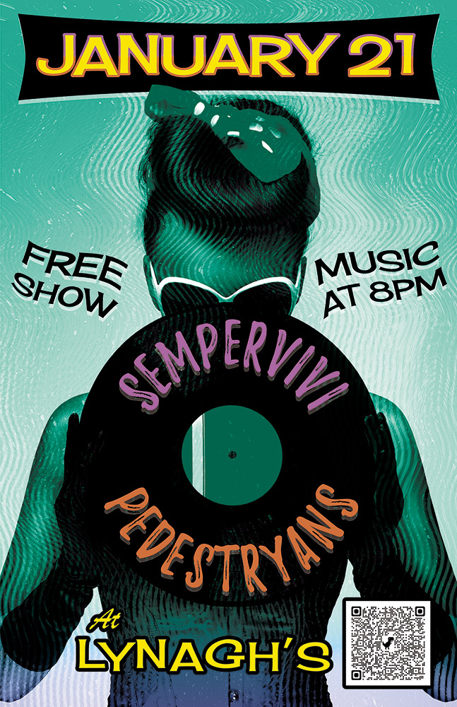
Here’s a retro concert poster that I designed for a 2022 show at Lynagh’s Irish Pub in Lexington. My friend Destry is a classy lady who sings and plays guitar in the blues based alternative rock band Pedestryans. Her selfie game is on point, and she often rocks a variety of vintage styles, so I thought featuring a classic 1950s style pin up girl would fit.
Retro Concert Poster Story
When I chose the vintage style pin up girl photo from my extensive stock image collection, I knew that I wanted to bathe it in an aqua blue tint. I overlaid the whole image with a wavy “static” pattern, so as to imitate vintage TV interference. Also, I envisioned wrapping the band names around the black vinyl record that she is holding. The bright pink and orange hues of the names help them stand out over the wax circle.
For the date at the top, I manually jumbled the letters in order to give it a retro, playful feel. I also jumbled the letters at the bottom of the page that spell out the venue name. The bright yellow date is encased in a typical 50’s “futuristic” style black curved shape. I then added a subtle gradient that fades the aqua blue to purple at the bottom in order to highlight “At Lynagh’s”. Other event information floats to the left and right of the pin up girl in black. I added a wave warp effect to it in order to give it some movement and also to increase the kitsch factor.
Contact Me If You Need A Retro Concert Poster
Are you holding an event that would benefit from a retro concert poster design? I love incorporating vintage 1950s elements into promotional ads! Contact me today to get started.
 Lynagh’s Irish Pub
Lexington, KY
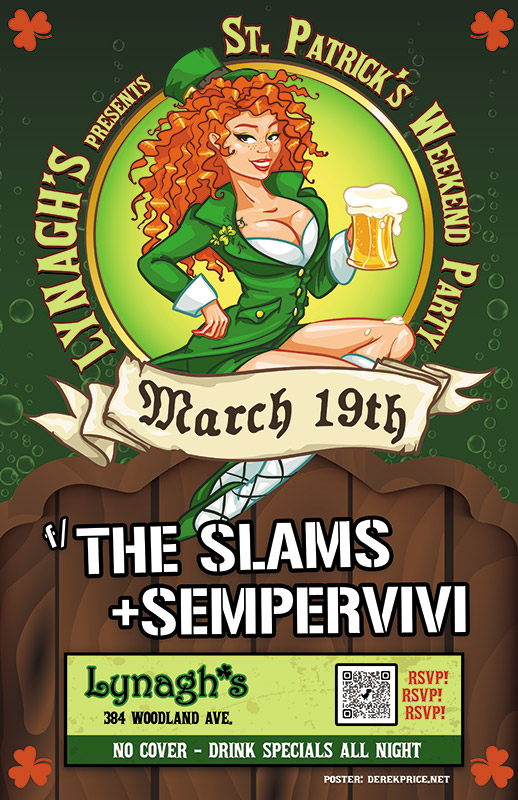
I experienced some of my favorite memories of performing original music live on stage at Lynagh’s. Lexington’s finest Irish Pub has always been good to me and my bandmates in Sempervivi. Since they are an Irish themed bar and grill, St Patricks Day is a hugely successful time of year for this bar. The Slams are a local favorite Celtic Punk style band. Therefore booking them to play with us at the pub on this occasion was a no brainer. Of course, I took on the task of drawing up the St Patricks Day poster design, so let’s dive in, shall we?
St Patricks Day Poster Design Story
I knew right away that the central image would need to feature a buxom Irish lass. Therefore, the perfect illustrated stock image portrays a luscious redhead in green leprechaun garb holding aloft a mug of foamy beer. After adding her to the composition, I wrapped the event name around the circular frame behind her. “March 19th” displays in a scrolling banner using an old English style font, while each of the band names is “stenciled” on the wooden fence our lucky lady sits on.
Additional event information also displays in a lime and dark green box at the bottom. In order to add a little flair to the dark green background, I inserted some fizzy bubbles, mimicking those founding in the beer mug. Finally, I added a solid orange shamrock shape in each corner to contrast the green and tie everything together.
Contact Me For Your St Patricks Day Poster Design
Are you planning a concert event or party at your venue for St Patricks Day? Don’t press your luck! Hire a professional graphic artist with over 20 years of experience to design your poster. Contact me today!
 The Rough Customers
Lexington, KY
Pick it up! The Rough Customers are Lexington, KY’s only third wave ska band – as far as we know! In 2014, my band at the time Analog Apostles performed with them and Nashville, TN soul rockers Ravenhill. Ravenhill made a tour stop in Lexington at the Sidecar, next door to Al’s Bar. The Rough Customers’ live show is all about fun, and that’s the vibe I was going for with this concert poster design.
Large format concert poster design
The featured photo of the classic pin-up girl and phonograph was given a “washed out” effect, which I made by reducing the colors using Adobe Illustrator. I then added the hypnotizing bright blue swirl in the background to enhance the kitsch factor. I lettered the bands’ names in a watermelon red using the retro “Badaboom” font, since it always signals good times. Additionally, I used the “Cherry Cream Soda” font for the other text, completing the poster’s vintage 50s feel. Finally, I added a QR code to the concert poster design so that potential concert goers could RSVP to the event on Facebook by scanning the poster with their smartphones.
The Rough Customers never disappoint when they take the stage, and always draw a big crowd. This show was definitely no different, since we filled the small room to capacity. I would like to think that my eye catching design helped with that aspect. I always design and print my 11×17″ posters to promote shows and other events that I put together. The large format gives me more canvas to play with. It is also more eye catching than a letter sized flyer when hung in store windows.
Hire me to create your concert poster design
Are you a musician or band needing a concert poster design? Contact me!
 Year of October
Nashville, TN
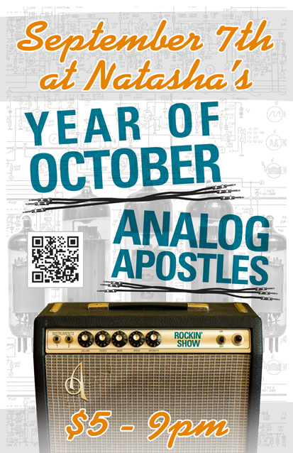
Year of October is a blues rock band based in Nashville, TN. I designed this 11×17″ concert poster art for a show with my band at the time Analog Apostles. The gig took place at the now defunct Natasha’s Bistro and Bar here in Lexington, KY. I had a lot of fun incorporating both of my loves, graphic design and music, into this composition.
Concert poster art design story
I themed the poster around a vintage Fender silverface tube guitar amp, which is similar to the ’78 Fender Twin Reverb I once owned. First of all, I replaced the Fender logo over the speaker grill cloth with AA’s “A” insignia. I added a shiny chrome effect and embossed it to mimic the original element. I also Photoshopped out the blue amp model name, and then replaced it with the words “Rockin’ Show” in a similar font. Guitar gearheads appreciated the attention to detail I added to this concert poster art.
As for the text, I used a sans serif font in turquoise for the band names, while choosing a fat script colored orange for the other information. The band name titles are colored similar to the amp name, and also use the same font. I “underlined” both bands’ names with sets of unrolled guitar cables. The orange script almost has a neon signage feel.
Finally, I overlaid a set of vacuum tubes on top of the amp schematic drawing in the background. I changed their colors to black and white to make the colors in the forefront pop. Because of this, these images come together to make the perfect background arrangement. I almost hid them in effect, but if you take the time to examine them, they really add to the whole package.
Contact me to design your concert poster art
Do you have a big show coming up and need poster graphic design that stands out? Contact me today.

Misty Mountain String Band
Louisville, KY

Misty Mountain String Band’s banner design on display at a show.
After designing MMSB’s CD layout for “Went to the Well”, the band returned, asking me to create a large banner design. This three foot by five foot vinyl banner travels with the band and helps the boys look professional when on stage.
Banner design for Kentucky bluegrass and folk band
The affable string band sound describes their sound as “What it sounds like when a banjo smiles.” Similarly, this banner is both warm and inviting. The large banner layout features text and ornaments arranged in a vintage two color “show poster” style. First, I set the stage with a neutral color background with a rough burlap texture. I then mixed the two big, bold fonts for the main title in bright orange.
Afterward, I reversed the words “Misty Mountain” out of a long orange block using a Western style font. This is a divider in the middle of the main title to break the banner design up visually, and it function as ground for the squirrels to stand on. I set the rest of the band’s name in a heavy sans serif style font. I randomly nudged the position of some of the letters in order to give the title the appearance of being manually screen printed by a letterpress such as Nashville’s Hatch Show Print.
After that, I added the band’s requested twin squirrel and banjo line drawings in a bold, dark green. This gives the overall design a natural feel with more weight. Finally, I added some distress to the entire banner design composition using a grunge pattern eraser. How much more bluegrass can you get? The answer is none – none more bluegrass!
Graphics for your concert promotional banner design
Are there big summer music festival bookings in your future? Do you need a large banner design to make your group look more professional on stage? Contact me today to get started!