Dr. Kasten is a Bible scholar focusing on the Book of Revelation. He hired me for his prophecy commentary, since my other book jacket designs impressed him. Specifically, I have created Christian book cover design for a number of other Kentucky authors. I dove headfirst into the role of Bible commentary cover designer.
Christian book cover design story
The author suggested a few stock images to use for the cover. He had a specific vision in mind, but he needed a professional graphic designer to bring it to life.
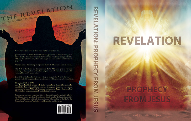
I weaved a collage of images together that were both literal and abstract. The Book of Revelation contains many passages that elicit different interpretations. As such, this Christian book cover design centers around a bright burst of light. It breaks through what could possibly be a desert scene. Clouds surrounding the burst also vaguely resemble a bearded figure appearing in the sky.
Since the image was so vibrant and fantastic, I decided I should keep the typography simple. I used the popular, yet reliable, sans serif font Myriad Pro. After that decision, I centered the main title “Revelation” over the burst of light. Then, I employed a blending mode in order to give it a spiritual, airy transparency.
I set the subtitle “Prophecy from Jesus” in a smaller font size over the “red clay” toward the bottom.
On the back of the book jacket, I juxtaposed a silhouette implied to be Jesus with a passage from the Book of Revelation. Both of these dark images float over a background that mirrors the deep orange and blue “sunset” scheme from the front cover.
Contact me if you need a Christian book cover design
Are you an author who needs a Bible commentary cover designer? Perhaps you are releasing a biography of an important faith figure, or writing a devotional. Contact me for your Christian book cover design.
This Eastern Kentucky reference center commissioned a library logo design and website package. My clients at Muhlenberg County Public Libraries recommended me. I previously had also provided a logo and website for them.
Traditional style green library logo design
The library board did not request very many specifics at first. They needed a strong, traditional mark incorporating shades of green. Therefore, Wolfe County’s staff chose the tried and true “donut” ring format from my initial mock up sketches. If it’s good enough for Starbucks, then it’s good enough for my clients. I selected the classic and strong Clarendon font to use throughout the library logo design. A serif font such as Clarendon is always a winner in applications like these. After that, I then wrapped the text “Wolfe County Public Library” around around the ring frame. Outline strokes of varying thicknesses in the ring helped give the mark a subtle uptown feel.
The arched ribbon that reads “WCPL” is the focus element, and also suggests a bookmark. The opened book in front of the ribbon creates depth and perspective. A simple “Est’d 1967” in front of the book reminds viewers of the library’s staying power in the community.
Finally, I topped the design off with the green and white mountains sprawling in the background. These elements are a nod to the beautiful mountains and hollers in Eastern Kentucky. WCPL ordered several tweaks and revisions as we went along. In the end, however, the library board were very happy with the finished product. It was time to move on to their website design.
“Book” me to design your library logo design
Are you a public library coordinator? Do you run a small business or nonprofit? Do you need a strong, traditional mark to represent your brand? Contact me today.
Here is another book cover graphic design for my old friend George. The author has also been a pastor here in Kentucky for many years. This is a short guide he wrote for growing and strengthening church congregations. As such, I chose to go the literal route with this cover design. Come along with me to the next stop in my journey as a Christian book cover artist.
Christian book cover artist – graphic design story
George liked my idea of juxtaposing a weightlifter along with a shining stained glass window overhead. I simplified the stock photo of the athlete lifting weights to a sepia tone. This makes it a subtle image without completely losing it in the black background, since the stained glass window and the title itself are the main elements. I faded the image of the bench press behind the description on the back of the jacket so the text in front of it is legible.
The title on the front cover has a red grunge frame similar to a rubber stamp. I used the LHF Pilsner Script for the words “Lessons On” for a weighty, vintage feel. “Strengthening the Church” is fittingly set in a strong serif block font. The red and white title pop on the stark black background.
His publisher has very exact standards for formatting. Since that is not his forte, the author requested my help. George entrusted me with the finished format of his original manuscript. I also arranged its indexes to the publisher’s specifications. Buy the book in paperback on Amazon. See also my design for George’s “Lessons on the Lord’s Prayer” cover design.
Hire me for your own book cover graphic design
I truly enjoyed working on this art since physical fitness and spiritual fitness are important to me. I also enjoy visualizing concepts that I am not as familiar with. In some cases you actually can judge a book by its cover!
No matter what your subject matter, I can help you make your work look its best for potential readers. Contact me today.
George Thompson is a pastor in my hometown in Western Kentucky, and is one of the first humans I can remember knowing. George has authored several books on theology and travel. He approached me to reimagine his Lord’s Prayer book cover design for a reprint a new publisher was releasing.
I actually formatted his manuscript for their size and specifications, making a few minor edits, in addition to designing the jacket art. Read about the beginning of my journey as a Christian book designer.
Lord’s Prayer Book Cover Design Story
First, I set out to create a graphic design for this dust jacket with other classic devotionals in mind. Purple is a color which is often regarded as a spiritual color. This dates back to its rarity in Biblical times. Therefore, I created the cover’s background in pink and purple hues.
I then applied a blur filter to a royalty free stock image to complete the effect. Later, I enhanced the light elements of the image to suggest glowing rays of light peeking out of clouds.
The light centers on the book’s cover, in order to highlight the familiar “praying hands” pen and ink illustration. These give it a celestial feel. I focused on typography to create a high end feel for this volume.
The book’s title colors are deep purple gradients. This creates contrast against the lighter background. I set the words “LESSONS ON THE” in a classy sans serif font with extra spacing to justify its width over the words “LORD’S PRAYER”. I typed them in a tall, condensed specialty font that exudes class. Finally, I added a white “shadow” behind the text to give it a little more depth.
Christian book designer for independent authors
Whether or not your subject matter is Christian or religious in nature, I am your man. You should choose me since I love helping authors complement their work with vibrant imagery. Contact me today to get started.
Back in the year 2013, my home county’s library system contacted me for a huge rebranding project. They called on me to create a new public library logo design and website for them. Back when I was growing up in Muhlenberg County, Kentucky, I fondly remember participating in their annual summer reading program each year. I also would often stop in to check out books while I walked home on my way from my school, Greenville Elementary. Because of this, I considered the library logo art project to be a very special honor.
Public library logo design in Kentucky – fonts and Image
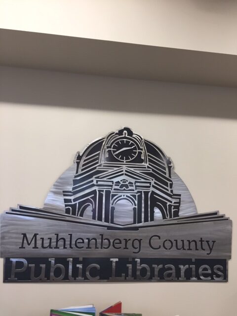
First, I created a line drawing based on the iconic county courthouse tower using the Adobe Illustrator application. This building happens to be the largest open belfry anywhere in the United States. The courthouse tower resides right across the street from the Greenville (Harbin Memorial) branch of the public library. MCPL also has a branch situated in Central City, KY.
After I drew up the focal vector image, I spelled out the words in the main title “Muhlenberg County Public Libraries”. I chose the Museo Slab serif style font. I love this font, since it creates an identity that looks both classic and modern at the same time. A simplified book shape opens up in the foreground in order to provide a tasteful contrast to the architecture portrayed behind it. It avoids the pitfall of potentially making the design too complicated by still not being too obvious or complex.
All of the elements’ weights are distributed evenly. The book’s shape gives the correct emphasis on the text. To give the piece some more variety, I set the words “Public Libraries” in a larger size at the bottom. The words “Muhlenberg County” reverse out of the book shape in white.
Public library logo color scheme and finishing touches
The dark blue and lime green color scheme is strong and eye catching, while still keeping things simple. Depending on the application, I set the background color in either a solid blue, or the gradient fade you see displayed here. As with all of my logo designs, I created a separate, simplified version in black and white. I have always maintained the belief that the best logos can be reduced down to this format. I love going “back home” to Western Kentucky and seeing my work displayed on signage and billboards. The library was such an important part of my childhood growing up in Muhlenberg County. Therefore, it is a good feeling to know that my work represents it to kids growing up there today.
Muhlenberg County Public Libraries Thistle Cottage Logo
Thistle Cottage history and public library logo design colors
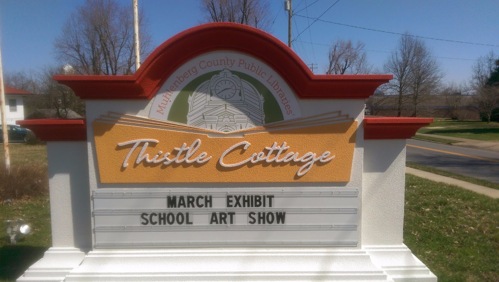
Later on in that very same year, MCPL returned to me for a new task. They requested a new variation of my original public library logo design. The new spin on the brand first involved a change in the color scheme. For this particular version, I decided we should incorporate a rustic copper brown and army green combination.
Both of these muted colors combine and hearken back to the heritage of the building represented by the mark. Thistle Cottage is a historic early 20th Century home on 122 South Cherry Street in downtown Greenville, KY. It was built in the year 1912, back when the Western Kentucky coal mining industry was still booming. It is located just around the corner from the Harbin Memorial library branch.
Thistle Cottage was formerly a cultural center that would host touring art exhibits. The city gave it to the public library system in 2013. They then converted it into a museum and art gallery space. MCPL also holds their annual community events there. These events include their Mother’s Day Victorian Tea party in May, along with their Pictures with Santa holiday series.
Thistle Cottage library logo art – fonts and finishing touches
A fun handwriting script font comes together in order to spell out the main title phrase “Thistle Cottage”. Once again, I reversed the title out of the large open book shape in white. Then, I made the book shape a bit taller. This way, it would frame in all of the main title text. I kept the “Muhlenberg County Public Libraries” text intact from the original logo design in this particular variation. Then, I arched it around the courthouse image from the original logo in the copper brown shade. Finally, I recolored the county courthouse in the olive shade of green.
The finished product I provided made the staff at MCPL very happy in the end. While it is obviously associated with the Kentucky public library system, the muted color scheme and classic script give the logo a vintage feel of its own.
Thistle Cottage logo signage gallery
Check out the finished product in print in the photo gallery below. The library features it prominently on the sign in front of the Thistle Cottage building.
“Book” me for your public library logo design!
Are you a library director in the process of launching a brand new library system or branch in your community? Perhaps your own library system has been using the same outdated library logo art for many years. You may very well be in need of an image rebrand! Whatever your situation may be, you should contact me! Everyone in your town will be checking you out! Sorry, for better or worse, I just can’t help myself when it comes to a good pun.
 Dr. Gregory Kasten
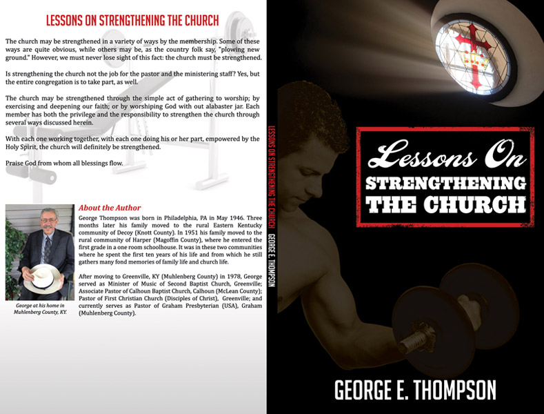 George Thompson
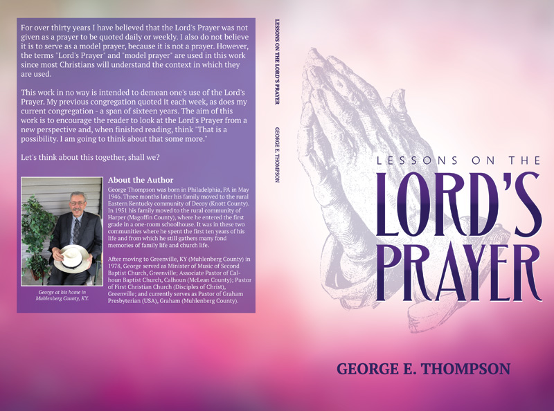 George Thompson