 Wellington Beck Music Group
Nashville, TN
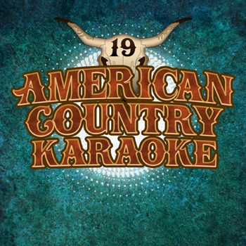
The groundbreaking “American Country Hits” series rolled on with the latest installment, Volume 19. Each volume includes both a “Hits” version (covers recorded by studio musicians) and a “Karaoke” version with instrumental tracks only. The karaoke album art design version that I created is pictured above.
Karaoke album art design story
This time out, I decided I should use a deep turquoise background. I blended a mottled grunge pattern that resembled marble into the rich greenish blue color. Then, I created an inner shadow layer effect for it. This effect fades into the background from a light to dark shade.
I also added a bright white burst brush shape located in the center of the artwork. I situated it between the background and the main title logo layers. When I added a glow layer effect to it, it really made it shine. It also caused the main title text to pop off of the screen.
After that, I contrasted the background elements against the main title. This title uses the same logo I created for the previous installments of the series. I set the words in the LHF Boston Truckstyle font. I proceeded to color it with a rusty shade of red, then added both satin and inner shadow effects to the letters. A light golden yellow inside stroke came together with a thicker brown outline in order to complete the title text’s rustic theme.
All of the elements come together to create an outstanding karaoke album art design. This, as well as all of the other installments in the series, is available on many online music retailers. These include Amazon, iTunes, and many others.
Contact me to create your karaoke album art design
Do you own a record label or a digital music publisher? If you need quick turnaround art to accompany your digital music, I am your graphic designer. Contact me today to get started!
 Fischbach USA