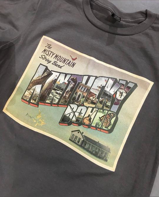
Misty Mountain String Band
Louisville, KY
I created this Kentucky shirt design for The Misty Mountain String Band, who are long time clients and friends of mine. They are surely the hardest working bluegrass and roots music quartet in the USA. I may be biased in this assumption, though. The Louisville foursome showcase traditional Kentucky instrumental and vocal sounds. Four voices create soaring harmonies over banjo, mandolin, stand up bass, and the six stringed acoustic guitar. Their distinct blend of folk and old time music styles creates a crowd pleasing live show.
As with their previous records, the group called upon their fanbase to help crowd fund their 2018 LP “Kentucky Bound”. The Kickstarter online fundraiser service was a perfect platform to do that. Since a new record always calls for new merchandise, they needed a distinctly Kentucky shirt design as a reward for their donors. As the details unfolded, it looked like I was about to become a Kentucky tourism shirt designer!
Kentucky shirt design story – choosing the right images
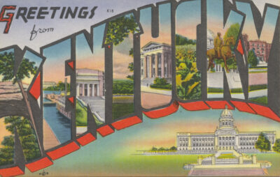 Their stand up bassist contacted me with a concept that was based on a vintage postcard designed to attract tourists to the Bluegrass State. Like the retro postcard, the shirt would feature a variety of Kentucky landmarks and attractions. We worked together to flesh out a variety of examples for their Kentucky shirt design. Finally, we all settled together on an iconic group of eleven notable ones. We decided that the shirt’s title letters should feature the following inside:
- The Natural Bridge at Red River Gorge
- Louisville Slugger Museum
- National Corvette Museum (Bowling Green)
- Dinosaur World theme park
- My Old Kentucky Home (Cave City)
- Belle of Louisville steamboat
- The Twin Spires at Churchill Downs (Louisville)
- The Kentucky state flag
- Peabody Coal Company’s “World’s Largest Shovel” (Muhlenberg County)
- An “F” style mandolin
- A Monarch butterfly
First, I started by hunting down the most appropriate royalty free images that I could find for each of the attractions. I then assembled the lettering for the main title from a tall sans serif font. After outlining the text, I reshaped each letter to make them stand out like those on the original design. Using the Adobe Illustrator application, I stroked the letters with thick black strokes and added a thinner white stroke inside. Then, I manipulated the text. I added both warp and 3D effects in order to mimic the text style featured on the original postcard.
Main title and photo retouching by Kentucky tourism shirt designer
Next, I cropped each of the photos so that they would fit exactly inside of the letters. As with the original design, some of the items also needed to take up the space of two letters. Peabody’s coal shovel was so enormous that it warranted taking up the “B” and “O” to get the full length effect. The patterns on the monarch butterfly’s beautiful wings deserved the extra space provided inside the letters “N” and “D”. After I laid out and cropped the images, I color corrected each of them. I did this adjusting their brightness and saturation factors so that each picture would balance the others out. Last of all, I blended some filtered copies together with the original photos in order to give them a painterly feel. I was ready at last to add the finishing touches.
Finishing touches on the Kentucky shirt design
In front of the faded and pale sunset background, I then set the band’s name. I employed a mix of italicized tall sans serif and script fonts. A majestic cardinal, which is the Kentucky state bird, rests its sturdy talons on the letter “I”. The red bird looks straight ahead to a bright future for our commonwealth. The goldenrod is the official state flower of Kentucky. The yellow flower also appears floating in the bottom left corner of the postcard. You might even choose to say that it appears as a garnish to balance all of the elements out.
Finally, this Kentucky shirt design features the historic Bill Monroe Homeplace in the bottom right corner of the postcard. This is a call back that is reminiscent of the Kentucky state capitol building, which is featured in the original postcard. As with the main title, I blended the original photograph with a copy of it that I stylized with a painterly dry brush Photoshop filter. I added an inside stroke to the rectangle shape in order to complete the postcard feel. To top off the shirt design’s composition, I later added a grunge texture overlay. This gives the whole piece a feel that looks both worn and weathered. A few minor revisions later, and we had a finished product.
Kentucky shirt design – fan reception
This design was roundly praised. When the teaser images were posted on the band’s social media channels, fans remarked that they couldn’t wait to get their hands on the new MMSB swag. That being said, this shirt graphic design turned out to be one of my favorite projects to date. The colorful postcard image really pops off of the mid grey colored shirt. It is always a pleasure to work together with The Misty Mountain String Band.
Contact me for your own Kentucky shirt design
Are you part of a Bluegrass band, a record label, or a small business which is based in Kentucky? Does your group need an original shirt design that pays tribute to your old Kentucky home? You can put full confidence in this Kentucky tourism shirt designer to get the job done. Contact me today!
 Sempervivi