Analog Apostles


Year of October concert poster artYear of October

Nashville, TN

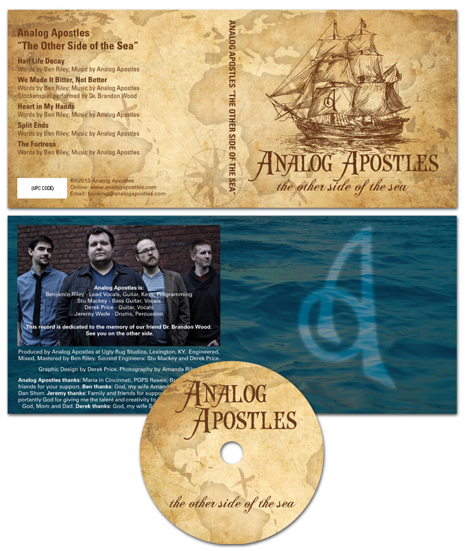
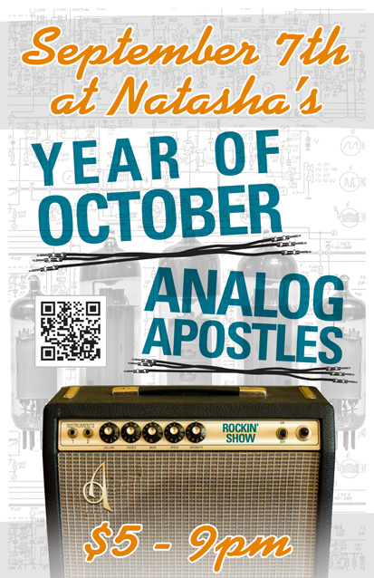
Year of October is a blues rock band based in Nashville, TN. I designed this 11×17″ concert poster art for a show with my band at the time Analog Apostles. The gig took place at the now defunct Natasha’s Bistro and Bar here in Lexington, KY. I had a lot of fun incorporating both of my loves, graphic design and music, into this composition.

Concert poster art design story

I themed the poster around a vintage Fender silverface tube guitar amp, which is similar to the ’78 Fender Twin Reverb I once owned. First of all, I replaced the Fender logo over the speaker grill cloth with AA’s “A” insignia. I added a shiny chrome effect and embossed it to mimic the original element. I also Photoshopped out the blue amp model name, and then replaced it with the words “Rockin’ Show” in a similar font. Guitar gearheads appreciated the attention to detail I added to this concert poster art.

As for the text, I used a sans serif font in turquoise for the band names, while choosing a fat script colored orange for the other information. The band name titles are colored similar to the amp name, and also use the same font. I “underlined” both bands’ names with sets of unrolled guitar cables. The orange script almost has a neon signage feel.

Finally, I overlaid a set of vacuum tubes on top of the amp schematic drawing in the background. I changed their colors to black and white to make the colors in the forefront pop. Because of this, these images come together to make the perfect background arrangement. I almost hid them in effect, but if you take the time to examine them, they really add to the whole package.

Contact me to design your concert poster art

Do you have a big show coming up and need poster graphic design that stands out? Contact me today.

Analog Apostles CD Art for "The Other Side of the Sea" EP

Analog Apostles

Lexington, KY

I designed this CD art for Lexington, KY alternative rock band Analog Apostles‘ debut EP “The Other Side of the Sea”. Since I played lead guitar in the band at the time, it was a no brainer for me to do the artwork. I was also very involved in the music production side.

Ben, the main songwriter and rhythm guitarist, thought of the title long before we recorded the first note. The album name and many of the songs made references to water, so we decided together on a nautical theme.

CD art – setting sail for the high seas

The four panel digipak layout started with an antique style treasure map background. Then, I overlaid a classical pirate ship illustration in brown as the focal point. The “A” monogram mark from the logo I designed was later superimposed onto the ship’s main sail.

After that, I set the band‘s name in an antique “swashbuckling” style font face. The album’s title then materialized in a classic cursive script. I capped off the design with a ghostly image of the band’s “A” icon over the dark blue ocean background in the tray card. Since the record’s theme suggested high adventure, a hint of supernatural mystery put it over the top.

From start to finish, this record truly was a DIY project. We performed every aspect of the production, from the recording process to ordering the album duplication. Ben’s wife Amanda did a great job with the posed band photography. Our fan base fully funded the CD’s production online via Indiegogo, which is a great fundraising tool for artists on a budget.

Hire me to design your CD art

Are you a band or record label currently hoisting the main sails on a new album? Contact me today for a CD layout design that will shiver your fans’ timbers.